- A Blog
- DVD extras
- Podcast
- Powerpoint
- Website
-terminology
-existing media products
-genre theory
-target audience
- digital media technology
Thursday, 12 December 2013
Tuesday, 3 December 2013
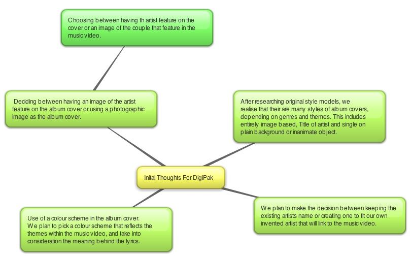
Action plan for the 4th
Having collected our footage we intend to upload, and organise the clips into those useful and ones we cannot use. We will import this into Final Cut Pro, where we will continue to edit the clips to construct a timeline. We will take into consideration the music playing at the time of each clip, so that the footage reflects what is happening in the song.
Plan to film more footage
Tuesday 3rd December:
We plan to return to Wicksteed park for scene 11, where shannon returns to the same spot beneath the tree, this time alone. She will a black dress, and carry flowers to represent her mourning. To add to this, the weather is forecast to be cloudy and white, which symbolises the loss she feels.
We plan to return to Wicksteed park for scene 11, where shannon returns to the same spot beneath the tree, this time alone. She will a black dress, and carry flowers to represent her mourning. To add to this, the weather is forecast to be cloudy and white, which symbolises the loss she feels.
Wednesday, 27 November 2013
Ancillary Task Questionnaire
Gender:
Male = 5 Female= 5
1) Do you prefer album covers that have an image of the artist as the main focus?
Yes = 7 No = 3
2) Do you prefer album covers where the title is...
Big and Bold = 3 Elegant and Italic = 5 Plain and Basic = 2 Other = 0
3) What colour schemes are most successful in the advertising an album of this genre?
Blues = 0 Greens = 0 Monotones = 3 Reds = 3 pinks= 3 Oranges = 1
4) Of these two album covers which appeal to your more?
 = 3
= 3  = 7
= 7
Male = 5 Female= 5
1) Do you prefer album covers that have an image of the artist as the main focus?
Yes = 7 No = 3
2) Do you prefer album covers where the title is...
Big and Bold = 3 Elegant and Italic = 5 Plain and Basic = 2 Other = 0
3) What colour schemes are most successful in the advertising an album of this genre?
Blues = 0 Greens = 0 Monotones = 3 Reds = 3 pinks= 3 Oranges = 1
4) Of these two album covers which appeal to your more?
 = 3
= 3 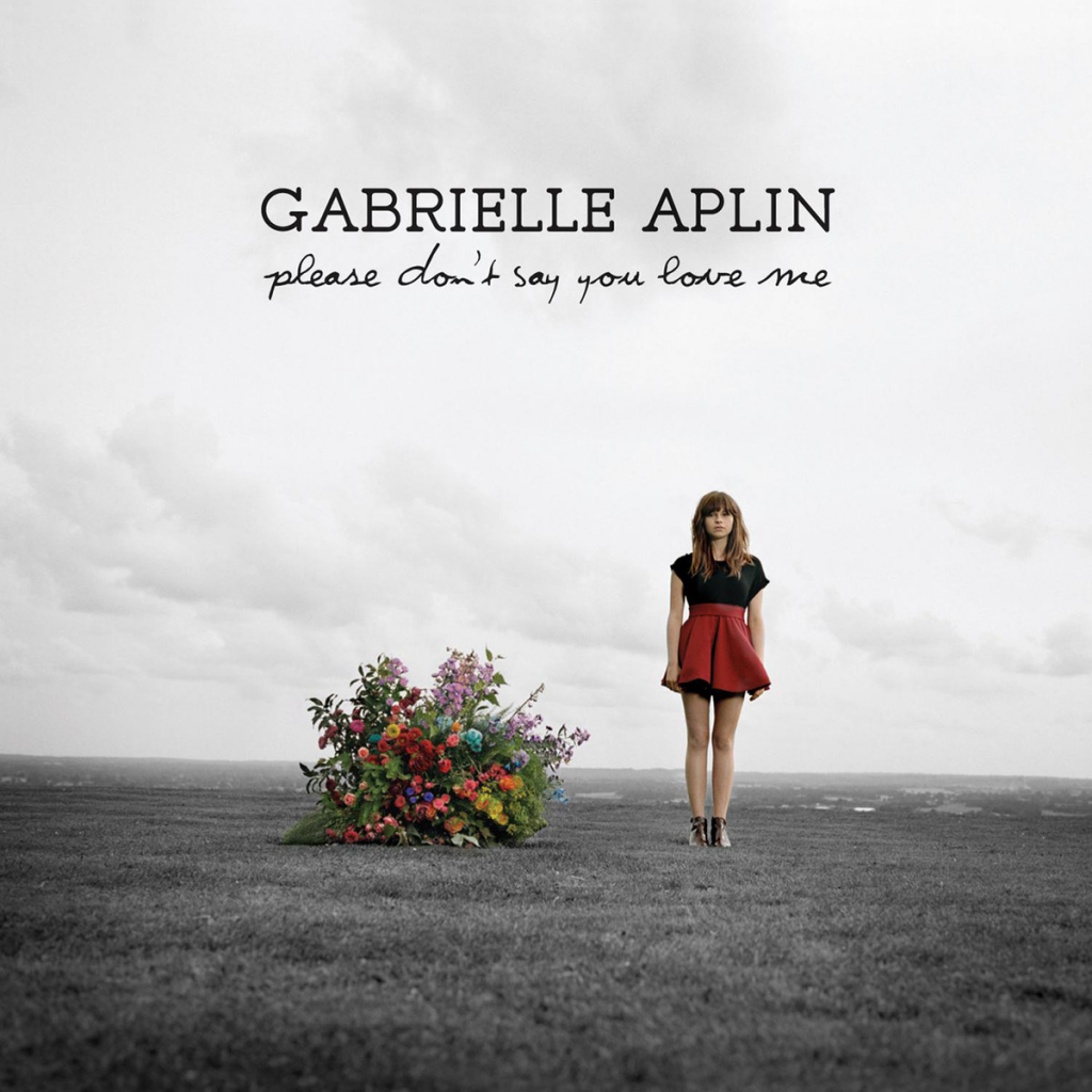 = 7
= 7
5) Why?
'Genre conventions, not too 'in your face' and looks more professional'
6) What kind of setting of the image do you think is most effective?
White studio = 4 Domestic Household = 0 Countryside = 3 Urban city = 0 Edited/constructed = 3
7) Do you prefer the insert inside the album to relate/follow the same housestyle as the images on the album cover?
Yes = 7 No = 2
...................................................................................................................................................................
We conducted research into the views of our target audience in relation to album covers. Following feedback we have found a preference for more understated images, where perhaps positioning or facial expression portrays the main theme. We have taken this into consideration when planning our ancillary task shoot - we plan to shoot medium close ups of our chosen model so that she is in focus and so that there is nothing distracting in the background to take away from the artist and the music.
Following feedback regarding the colour scheme, we plan to shoot a range of shots using different colour schemes in the models clothes and makeup, to which we will enhance in later editing stages.
Monday, 25 November 2013
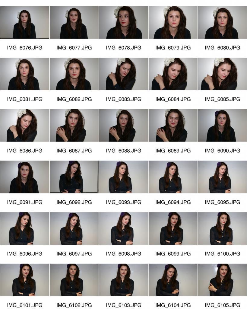
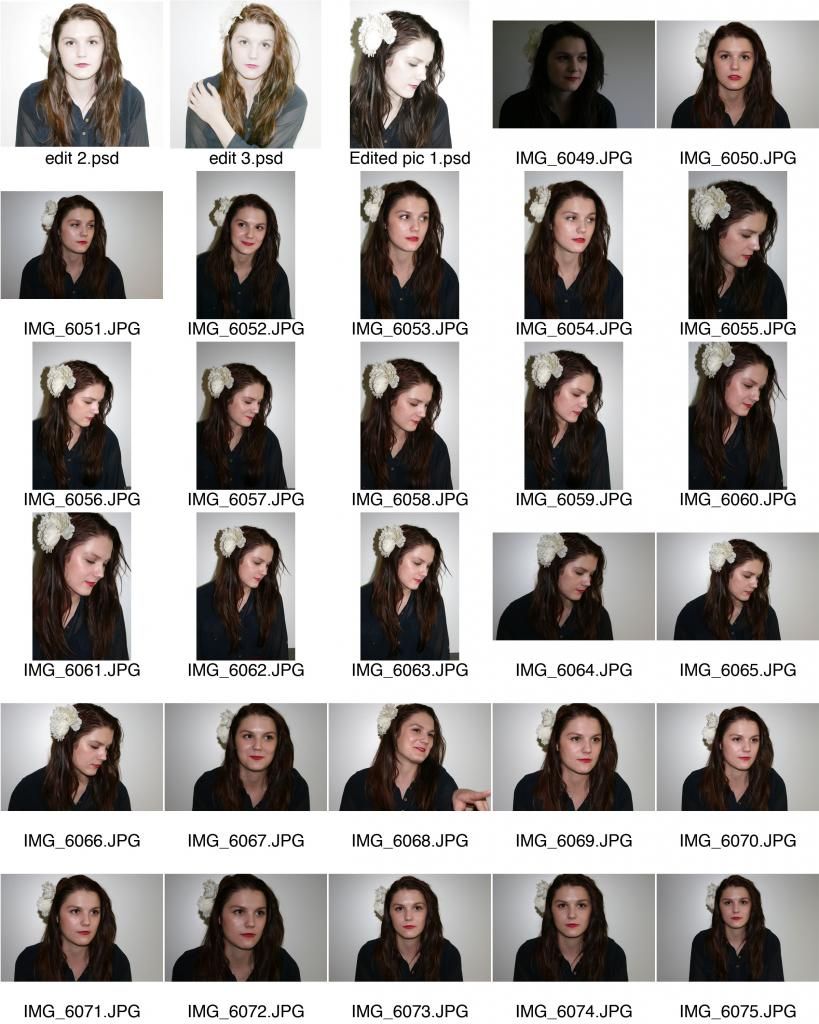
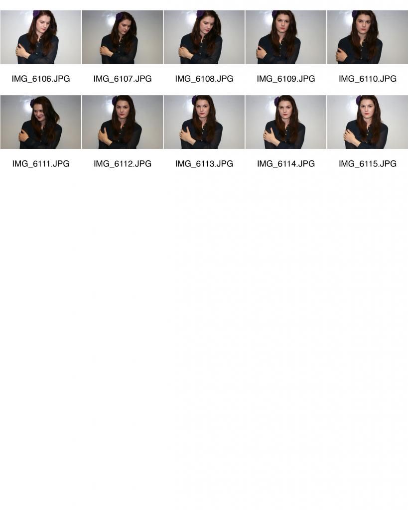
Ancillary Task Contact Sheet 2
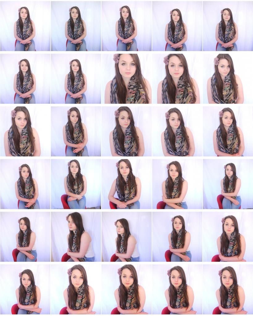
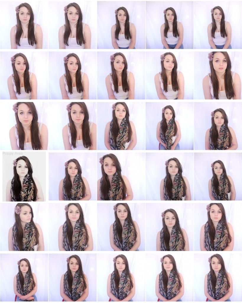 Based on feedback from our last photo shoot we decided to carry out a second - this time using light reflectors to enhance the quality of the images. This resulted in much brighter photos of a quality we are much happier with. However, we have still learnt many things from this second shoot that we intend to use for a third photo shoot. In these images we found it was difficult to pin point the emotion of the model due to her facial expression and posture. Understandably, we cannot expect her to produce exactly the image we are aiming to achieve as she is not a professional model and is simply helping us with our work by standing in to pose for our photos. We decided that next time it would be more beneficial for her to be sat\stood at an angle and we intend to direct her her so that her posture does not convey that she is uncomfortable or bored in any way and that she is a girl that is growing up but who is in control. We also decided that while her make-up is soft and natural looking, the black eyeliner contrasts with the black and bold colours in her scarf and that this is not soft enough for what we are trying to achieve in order to meet the conventions of our genre of music.
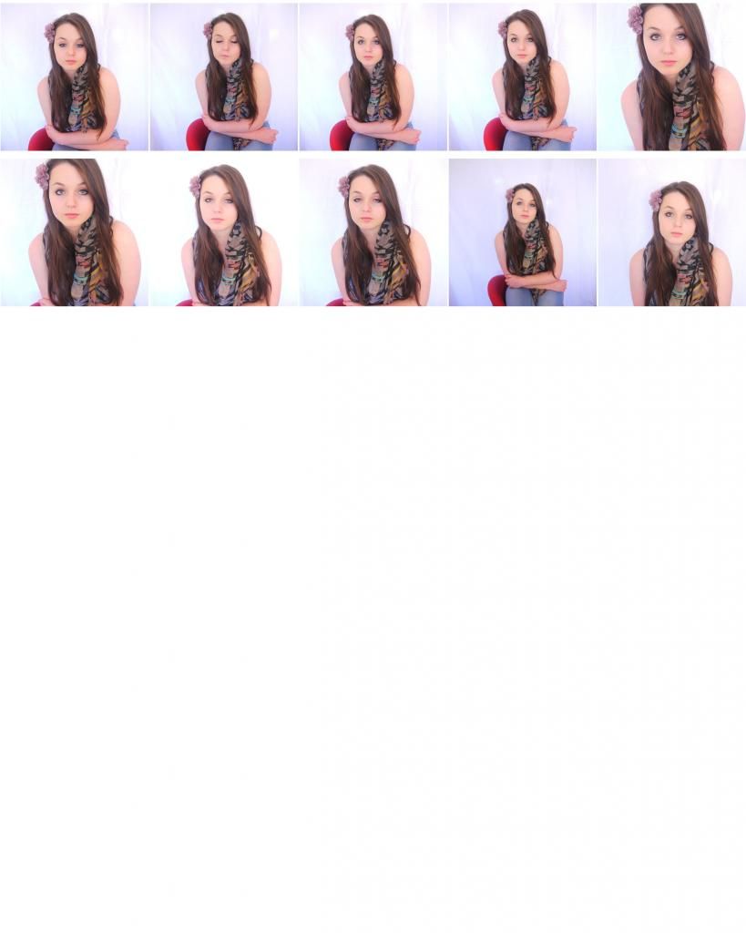
Plan for our next shoot:
- Shoot a variety of different positions, including the model standing and sitting.
- Experiment with coloured tops, to provide a range of colour schemes.
- Make sure the model wears softer and warmer make-up to follow genre conventions.
- Shoot at different angles, we plan to experiment with slightly higher and lower angles, rather than a direct eye contact shot.
- We need to make sure that framing of the shot allows for text.
- We intend to achieve the same methods of lighting because we thought this was successful in these shots.
Wednesday, 6 November 2013
Audience feedback
We carried out target audience research into genre conventions of digi-pak


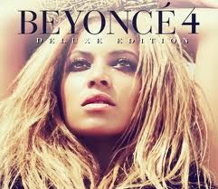
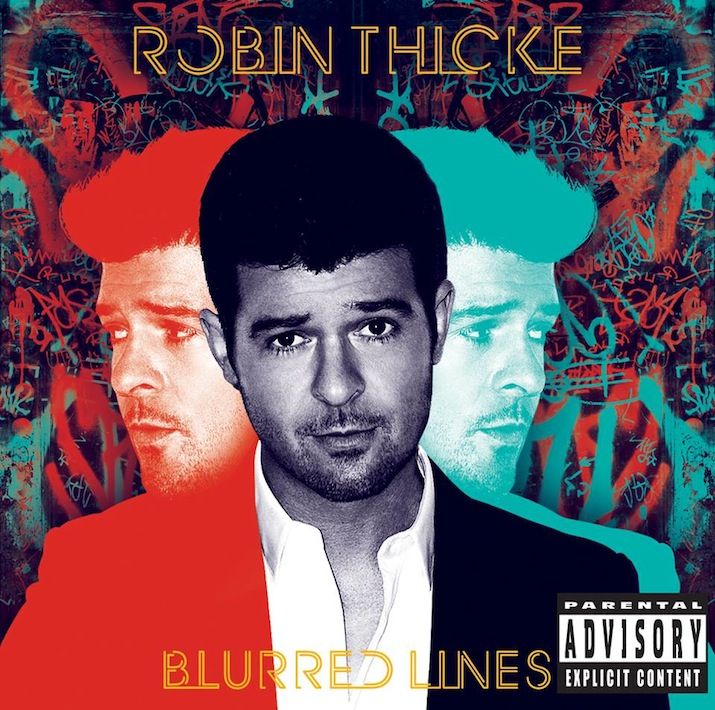
We carried out audience feedback by showing our target audience existing album covers of different genres (Gabrielle Aplin, Mika, Beyonce, Robin Thicke) we then asked them a series of questions about which genre they thought the music was, just by looking at the album covers.
On general feedback, we found that the bright colours of Robin Thicke and Mika conveyed almost immediately the pop genre. Due to this being a consistent audience response we have decided when editing our photography for our album cover, to reduce saturation and avoid bright, striking colours. We also intend to ask the model to wear pale coloured clothes - white or pink, with a similar coloured flower in her hair to maintain a colour theme.
We found that the cartoon animation aspect to Mika's album cover appealed to a more younger audience, who liked the 'cool effects', whereas, this actually was something our tsrget age group said they dislike and felt was not appropriate to the genre of the song we are using.
Beyonce's album cover was the favourite the audience members that we asked. She is the only focus of the cover so there is nothing happening in the background to distract from Beyonce and her music. The angle and position of the model makes the photography very striking and powerful.
Monday, 4 November 2013
Ancillary Task Contact Sheets
We carried out an initial photo shoot in order to produce drafts of our ancillary task and to allow us room to analyse the quality of the photos. This means we can spot any problems with lighting, positioning or colour and correct this in a second shoot. From looking through the photos we have decided that the dark colour of her top does not work well and plan to have our model wearing a white/pastel colour top in our next shoot. For the next shoot we intend to spend longer before the shoot on hair and make-up so that it does not look like she is just at school - in order to make the photography look more professional.
Monday, 28 October 2013
Action Plan Week 1
Monday 28th October:
Create detailed plan for our next film date, including locations, times and costumes.
Tuesday 29th October:
Carry out our first shooting for our ancillary task to produce an initial set of photos we can begin to edit to create a first draft.
Wednesday 30th October
Begin editing our images for the ancillary task (album cover). Continue research into existing products surrounding album artwork: what is successful and what fits the genre.
Thursday 31st October
Gain audience feedback on our initial draft of our ancillary task and on various fonts we have selected - producing different drafts for the audience to state which they prefer.
Friday 1st November
Following feedback adjust our drafts using
Wednesday, 9 October 2013
Re- Planning
Unfortunately, our male protagonist Reece Coles has broken his knee, we have therefore decided that the quality of our music video will be significantly impacted if we continue to use him due to continuity errors. Our lead role having a broken leg makes no sense to the narrative or raw footage we have previously obtained. As a result. we have chosen to re-film using a different male actor.
Plans to re-film:
We plan to re-film with the new actor on the 21st and 22nd of October. If weather conditions are poor we will film scenes indoor scenes, or scenes that having dull weather/ rain which we will use to our advantage to convey change in atmosphere.
Our new actors will be Ross Mulligan and Shannon Porter.
Ancillary task experimentation
After researching existing products, we decided to experiment with editing images on photoshop. We used an image from Gabrielle Aplin's EP cover as a template to then practice different techniques and effects.
We searched for different brushes on myphotoshopbrushes.com, we then downloaded a selection which we thought met the conventions of our chosen genre and the needs of our target audience.
Once on photoshop we experimented with layering different styles and effects on different layers of the original image.
This is an example of an experimentation we created, using various effects and overlay filters. We've decided that we like the brushes and colours used because it makes the photo more symbolic and eye catching. However, we have learnt that the quality of the original photograph is extremely important because it is the basis of the entire advertisement.
Despite this not being our own photography, we have received positive feedback from our target audience members who like the use of different colours and brushes.
This is our second example of an experimentation we created, again using various effects and overlay filters. Intsead we decided de-saturating the image provided more of an impact and brings focus to the model rather than the background. In our own photography we have decided to include red as a colour theme, where the model wears red props, therefore we want the background to be dark so these stand out better. Also, the darker colours reflect themes within the music video and lyrics.
We searched for different brushes on myphotoshopbrushes.com, we then downloaded a selection which we thought met the conventions of our chosen genre and the needs of our target audience.
Once on photoshop we experimented with layering different styles and effects on different layers of the original image.
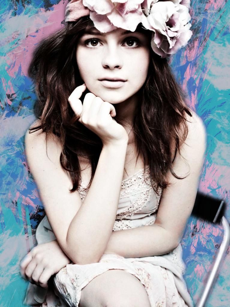 |
Experimentation One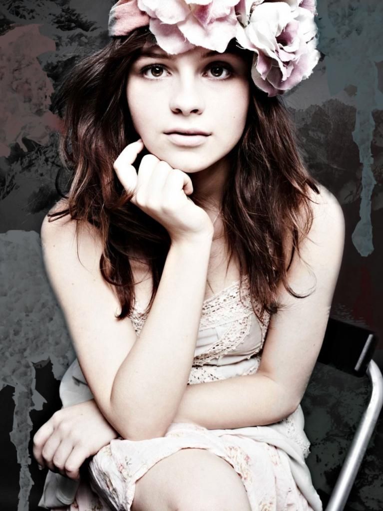 |
This is an example of an experimentation we created, using various effects and overlay filters. We've decided that we like the brushes and colours used because it makes the photo more symbolic and eye catching. However, we have learnt that the quality of the original photograph is extremely important because it is the basis of the entire advertisement.
Despite this not being our own photography, we have received positive feedback from our target audience members who like the use of different colours and brushes.
This is our second example of an experimentation we created, again using various effects and overlay filters. Intsead we decided de-saturating the image provided more of an impact and brings focus to the model rather than the background. In our own photography we have decided to include red as a colour theme, where the model wears red props, therefore we want the background to be dark so these stand out better. Also, the darker colours reflect themes within the music video and lyrics.
Saturday, 5 October 2013
Wednesday, 2 October 2013
DigiPak Artwork Audience Research

The first people we asked were a group of 17 year old boys. All 3 decided immediately that they preferred the photo of the model because she is attractive. They also liked having the image of the singer/songwriter on the front cover of an album because it is promoting her music and not a well taken photo.
The second person we asked was a female adult. She showed preference for the landscape option because while ambiguous the field of sunflowers has connotations of happiness and romance which reflects the themes within the lyrics.
The third person we asked was an adult male who is also a musician, because of this he had strong opinions of what he feels successful in the music industry. He said that he would not chose either of them because they were too contrived and that he prefers artwork with a more spontaneous and mysterious element rather than artwork that is designed purely to sell.
We then asked a teenage girl who preferred the silhouette of the couple because it clearly indicates the romantic genre. She says she was least likely to pick an album featuring a landscape because it is too generic.
Another girl and a boy that we asked separately said the image of the artist appealed most as it was more relevant to the music and offers more credit to the artist.
The final male respondent that we asked said he preferred the silhouette because it is the most artistic. We then asked whether this would be different if there was no featured couple and he said yes, they made it more symbolic.
..................................................................................................................................................
We have decided following feedback that we intend to use the silhouette of the couple as our main style model. Although this is not the most popular choice, we feel it relates well to the music and lyrics but also the narrative of our music video.
Monday, 30 September 2013
Action Plan week 7
Monday 30th September:
- Planning for ancillary task. Plan a name for our production company. Including locations, model, mise-en-scene, theme and style fonts.
- Develop knowledge of theories relevant to music videos.
Tuesday 1st October:
- research into different fonts, analysing different examples
- ring Wicksteed Park to receive permission to film there.
Wednesday 2nd October:
- Start working on ancillary task. Chose a font, colour theme, titles and plan shots.
Thursday 3rd October:
- Create mind map of all our ideas for the ancillary task, to then receive feedback from our target audience to help us decide which idea is the most successful.
Friday 4th October:
- Record more feedback on what our target audience feel is successful in album cover work.
Thursday, 26 September 2013
DigiPak Artwork Analysis

Lenka's Digipak Cover:
This album artwork makes use of bright bold colours which reflects the bubbly, upbeat tone to her music befitting the pop genre. It features the artist centered within cartoon, hand drawn graphics almost as if a child has doodled this has connotations of innocence meaning the music is most likely to be family friendly with no explicit lyrics.
Emeli Sande DigiPak Cover:
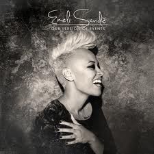 This album artwork is desaturated in black and white however, the lighting is soft with a focus on the artist. The font is a similar soft and curved style symbolising the elegance and mature themes within her music. The artist is facing away from the camera, as if she is laughing at someone else rather than looking straight out at the audience. This conveys that the album is about her music and what is important than her instead of about the audience and consumers.
Tom Odell Digipak Cover:
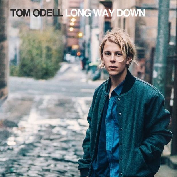 The artist is oddly not centered in this album cover, in contrast to many other album covers he is placed to the right in the framing of the photo. While he is posed to look straight at the camera he has his hands in his pockets in a careless manner. This gives the impression that he is a real person like any other and that his music is relatable to the audience. The artist has an almost scruffy, unkept look about him which suggests that he is not bothered about appearances and that his focus is on the messages in his lyrics. This idea is supported with the simple, basic font.
Taylor Swift Digipak Cover:
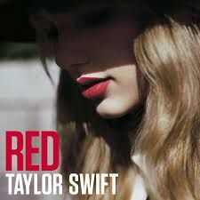 This album cover features a close-up of the artists face, there is nothing else on the cover with the exception of the title and her name. Half of her face is cast in shadow and the photo has been desaturated in contrast to the bold connotations of the title 'Red'. The way the artists head is lowered with her eyes down almost suggests that she is disconnected from the audience, distancing her from the consumer. This sets a more serious tone to her music than in previous albums.
Owl City Digipak Cover:
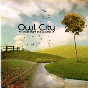 This album cover feautures no artist or model but a landscape setting which contrasts with the name of the band - Owl City- owls are nocturnal animals which holds connotations of nightlife, so you might expect a city scene set at night, featuring skyscrapers lit up . Instead they have used a very natural, idealistic setting without a single person or man-made object insight, presenting an uncorrupted world.
 Wednesday, 25 September 2013
Edit List
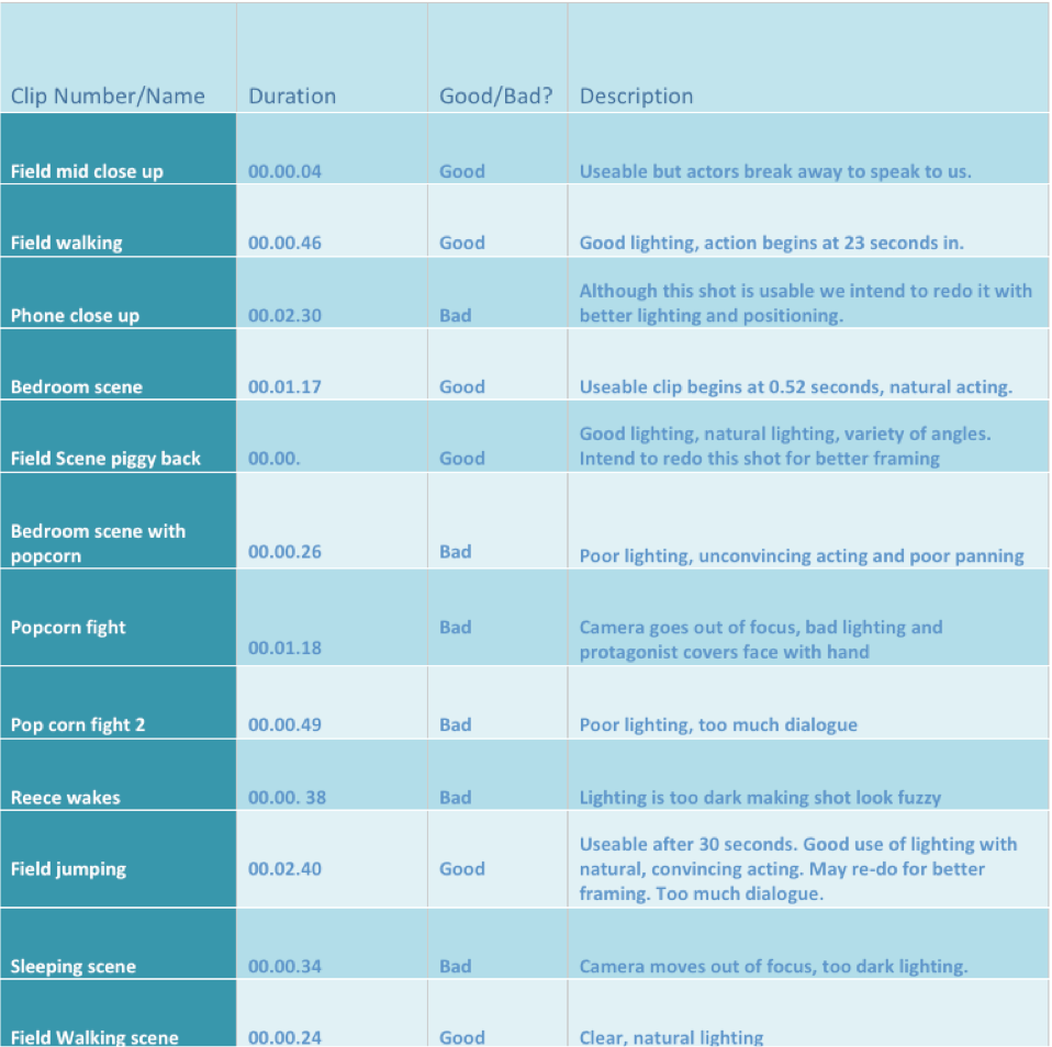
This is an edit list in preparation for the editing of our music video. This allows us to distinguish between which shots we want to use and which we do not, helping us with time management as we have a document we can refer to so we wont have to go through every piece of footage again.
Tuesday, 24 September 2013
Action Plan For Week Six
Monday 23rd September
Research romantic genre for music videos and apply to our own storyboard.
Tuesday 24th September
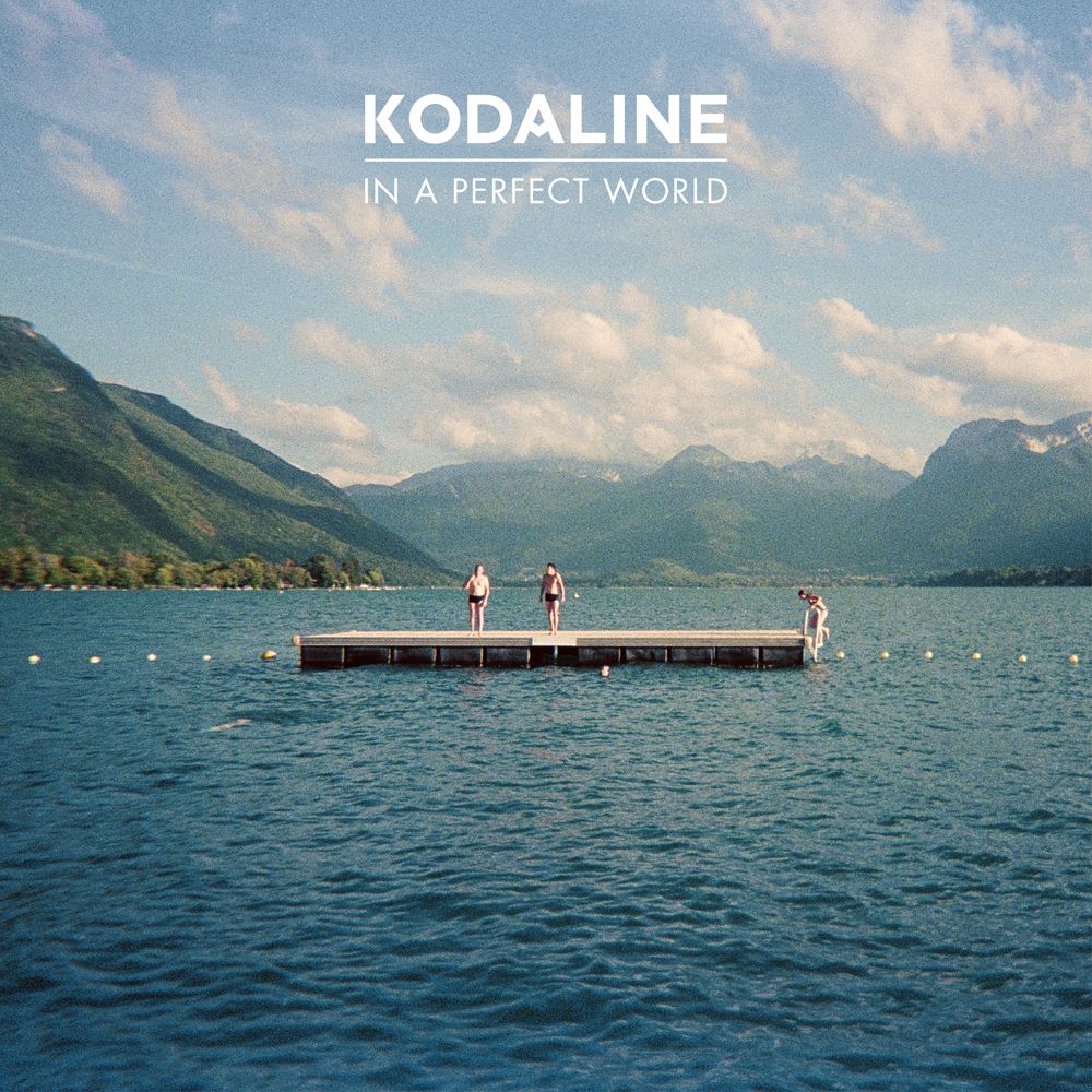
Analyse Kodaline's music video for 'High Hopes' for romantic genre conventions as outlined by a member of our target audience.
Wednesday 25th September
Use Photobucket to to re-upload all of our photos to a higher quality and enhance our planning and research aspect of our coursework.
Thursday 26th September
Produce edit list in preparation for editing our footage.
Plan our next day of filming and upload evidence of this to our blogs.
Friday 27th September
Make sure everything is completed and uploaded to our blogs.
Ensure that we are prepared for our next day of filming - upload permission forms for borrowing school cameras and allowing us to use footage of our actors.
Research romantic genre for music videos and apply to our own storyboard.
Tuesday 24th September
Analyse Kodaline's music video for 'High Hopes' for romantic genre conventions as outlined by a member of our target audience.
Wednesday 25th September
Use Photobucket to to re-upload all of our photos to a higher quality and enhance our planning and research aspect of our coursework.
Thursday 26th September
Produce edit list in preparation for editing our footage.
Plan our next day of filming and upload evidence of this to our blogs.
Friday 27th September
Make sure everything is completed and uploaded to our blogs.
Ensure that we are prepared for our next day of filming - upload permission forms for borrowing school cameras and allowing us to use footage of our actors.

High Hopes - Kodaline analysis for genre conventions
We have looked at the following conventions of the romantic genre:
- A complex narrative so that the audience can relate to emotions and feelings to make the lyrics of the song meaningful.
- Close ups of the eyes, lips, nose and hands and two-shots of both the guy and the girl.
- Reoccurring motifs of flowers, hearts and bright colours.
One of our target audience members outlined a preference for Kodaline's music video for their single High Hopes. We then decided to analyse this for conventions of genre that we could use in our own music video.
The use of smudged, black make-up around the protagonists eyes immediately shares connotations of emotional distress reflecting the atmosphere of the music video. This evokes emotion from the audience which we think adds to the success of a music video as this makes the audience more committed to watching the music video as they have an attachment to the characters through emotional interaction which the audience may relate to. This is typical of the romantic genre as it makes the song more meaningful because there is a narrative that gives context to the lyrics. Their emotions are conveyed through the use of lots of close ups of the protagonists faces in a shot reverse shot format, creating a connection between them because they communicate without the need for words, strengthening their relationship. This is an aspect which we intend to incorporate within our own music video.
One particular aspect of this music video that we really liked is the elliptical editing during the car scene. The camera remains in the same position but cuts between different times to show the passing of time. In each shot the protagonists are doing something different showing the depth and variety of their relationship. This also adds interest for the audience as it increases the pace of the scene. However, when the characters face tragedy the shot transitions become fade outs instead of jump cuts which makes the scene more climatic but slows the pace. At the beginning of the video, slow motion is also included to evoke more emotion.
Storyboard Interviews
Interviewees: Connor Morrice, Liv Mawby and Michael Navarro-Marin
We interviewed 3 members of our target audience.
Thursday, 19 September 2013
Initial Footage - First day of filming
This is the footage we gained following our first day of filming. We have decided to re-shoot the scenes that take place indoors as the lighting affects the quality of the footage. We've learned that we need to manipulate the lighting in order to produce shots that are of the same quality as those that were filmed outdoors. We will do this by using natural lighting wherever we can and producing light reflectors to enhance the lighting that we have.
We intend to:
- Use as much natural light as possible in the indoor scenes - even those set at night - to make it seem as if it's set at night we plan on filming during late evening so there is enough natural light for the shots to be clear but not too much sunlight to make it unconvincing.
- We plan to make light reflectors using white sheets and tin foil to use when shooting the indoor scenes. We will evidence the making of these to assist with our filming.
- We have also realised that the height difference of our actors presents a difficulty with framing shots. We intend to plan and concentrate on making sure that each shot is well-framed, taking into consideration the significant difference in size of our two actors.
- Because of the size difference of our actors we have also decided to rearrange the actors so that Shannon is always at the front of the shot, because Reece's size overpowers her.
- We need the lighting to be brighter and better positioned so that when cutting between scenes the change isn't too contrasting.
Monday, 16 September 2013
Shot List
This is a shot list in preparation for filming, the different scenes are organised in the order that we intend to film in.


Friday, 13 September 2013
Weather Forecast
This is the weather forecast for Monday 16th September when we intend to begin filming one part of our music video. Currently it is forecast to be sunshine and cloudy which is ideal for filming these particular scenes as we would like warmer lighting to convey the happy atmosphere.

Thursday, 12 September 2013
Final Story Board Upload


1) The establishing shot will be a medium long shot of the protagonist sitting at a window seat looking out. The lighting will be bright and natural coming through the window. The camera will then zoom into a mid close up of the protagonist which we will then cut to a close up of the girls face, showing tears to convey her sadness and grief. The atmosphere at this point will be distressed creating a tone of mourning.
2) The camera will then cut to the protagonist picking up a framed picture of herself and her boyfriend. The camera will then pan around the protagonist to an over the shoulder shot. The lighting will remain natural from the window. This scene is set in the present tense.

5) This scene will show the couple sitting up against a tree. reading a book called 'PS I Love You', we decided to include this book as it is symbolic of romance and loss, which are themes that are prominent in our story line as our main protagonist dies. Therefore, this foreshadows later events in the music video. The female character will be blowing bubbles which will represent how delicate their happiness is at this point.
We will show a close-up shot of the page number, and the male protagonist inserting a book mark when she's laughing too much for him to continue reading.
6) We plan to use a variety of shots that take place as the couple walk down a dirt track among fields. Shots will include them laughing, having fun, messing around. We have chosen to use a rural and isolated location as this brings focus on to the couple, almost as if they're the only ones that matter to each other. They're the most important aspect of each others lives.

7) We will then shot scenes located in a more domestic environment, where the couple seem at home and comfortable with each other. We plan to show them playing and laughing. We will use artificial lighting in the form of fairy lights to create a romantic atmosphere, but the fact that the lighting is getting dimmer and darker as opposed to the natural bright lighting prior to this, represents something going wrong in the future.
8) The camera will then cut to a close up shot of the alarm clock reading '2:37' or a similar time in the early hours of the morning. This immediately conveys to the audience that something is wrong. The camera will then pan to the male protagonist who sits up abruptly in bed, waking his girlfriend because he is in pain. Despite having no dialogue to communicate what exactly is going on, the audience are able to infer to what has happened. We found from studying an existing clip from 'What To Expect When You're Expecting' allowed us to understand that this is an effective way to explain to the audience that our protagonist needs medical attention.

9) The next scene includes the male protagonist being helped into the car by his girlfriend, this does not conform to gender stereotypes, which is something our target audience outlined as something they would prefer in a music video. Typically it is the female character who is portrayed as being vulnerable, so we have chosen to present our male character as being the dependent one in this scene. The pace of the camera will be slowed down to illustrate the change in tone, in comparison to the previous scenes. The camera will also include dolly shots to close-ups of the male protagonist's face, to express his sad and fearful emotions.
10) We will include a mid close-up shot of the hospital sign to confirm that something is seriously wrong and that they are driving to seek medical assistance. As a possible scene to follow up we are considering shooting a scene showing the couple sitting in an office environment, speaking to a doctor. Although there will again be no dialogue, through facial expressions and body language the audience will understand that the couple are receiving bad news in regards to the male protagonist's health.

11) We then return to scene 2, showing the over the shoulder shot of the female protagonist clutching the photo frame. This will allow the audience to understand that the video has returned to present tense. Showing her on her own symbolises that she is now alone, having lost her boyfriend, who is featured in the photo but no longer with her.
12) We then plan to return to the same location where the couple first appear together (Wicksteed Park) this will include various shots showing her placing flowers under the tree where they had previously sat together, clutching the book that he had once read to her. A close-up shot will reveal the female protagonist opening the book to the same page number seen in scene 5, where the bookmark still remains. She will be wearing a black dress which is symbolic of grief and mourning.
13) The camera will zoom in on the female character writing a note that says 'I miss you', which she attaches to a paper lantern. We will the cut to a mid-close up of her releasing the lantern and then finally a long-shot as the lantern rises in the air, leaving her standing in a field alone.


Tuesday, 10 September 2013
Music Video History
Although the origins of music videos date back much further, they came into prominence in the 1980s, when MTV based their format around the medium. Prior to the 1980s, these works were described by various terms including "illustrated song", "filmed insert", "promotional (promo) film", "song video" or "film clip".
The first step towards music videos began in 1894, with sheet music publishers Edward B. Marks and Joe Stern. Using a magic lantern, Thomas projected a series of still images on a screen simultaneous to live performances. This would become a popular form of entertainment known as the illustrated song.
2005 saw the launch of the website YouTube, which made the viewing of online video much faster and easier; Google Videos, Yahoo! Video, Facebook and Myspace video functionality, use similar technology. Such websites had a profound effect on the viewing of music videos; some artists began to see success as a result of videos seen mostly or entirely online.
More recently MTV now provides streams of artists' music videos, while AOL's recently launched AOL Music features a vast collection of advertising supported streaming videos. The Internet has become the primary growth income market for record company-produced music videos.At its launch, Apple's iTunes Store provided a section of free music videos in high quality compression to be watched via the iTunes application. More recently the iTunes Store has begun selling music videos for use on Apple's iPod with video playback capability.
Monday, 9 September 2013
Action Plan for Week 4
Monday 9th September
Analysis of story board and receive feedback from target audience in interview format.
Begin research into the history and development of music videos.
Tuesday 10th September
Complete research into the history
Begin research into DigiPaks and existing products
Structured Study
Upload history research and DigiPaks
Wednesday 11th September
Textual analysis for the conventions of genre relevant to our music video
Thursday 12th September
Upload all photos to a high quality
Thursday, 5 September 2013
Research and Planning

We annotated a lost of aspects required for successful research and planning with the intention to improve certain aspects.
This includes:
- Research into genre conventions
- Increase interactivity of blogs
- Analyse print based products
- record target audience response to music video
- Analysis of existing music videos with voice over on final cut pro.
Wicksteed Park Permission Enquiry
We emailed Wicksteed Park, in Kettering, asking for permission to film scenes of our music video at the park. Due to the park being public space, we thought it would be beneficial to gain permission before using it in our video and to alert the managers of our intentions.

Wednesday, 4 September 2013
Target audience feedback on draft analysis
Having received feedback from different members of our target audience has helped us to understand their expectations and needs within music videos. They have outlined that a key factor in the success of music videos is that a variety of different shots helps to make the video more enjoyable to watch whilst clarifying the narrative.Therefore, we have revised our story board to include various different shots within each scene.
They thought that the story board conveyed the genre well, and the romantic theme was evident throughout which means it fulfills the conventions of this genre of music.
Tuesday, 3 September 2013
Prop List
- Bottle of bubbles
- Paper lanterns
- Matches
- Hot chocolate
- Pop Corn
- Picture frame ( with picture of couple)
- Book - PS I love you
- Cameras
- Car
- Ice-cream
- Flowers
Narrative Theories
Our music video surounds a couple, who are the only characters that feature throughout, rather than a protagonist and antagonist. This challenges Propp's theory of character types as the two main characters oppose this completely. Rather than following narrative of the 'hero' being presented as having a challenge to overcome we have chosen to present our protagonist as being weak and vulnerable having experienced loss. Our male protagonist challenges stereotypes because he is the one who becomes physically weaker and dependent on the female protagonist, opposing the assumed masculinity of the male gender. The results of our audience survey showed that Todorov's equilibrium/disequilibrium/equilibrium narrative structure was not as popular as a non-linear format. We have chosen to use a circular narrative structure, beginning at the end/climax of the story, that proceeds to take the audience through past events - following a non-linear structure - before returning back to the end. Our audience thought that this provided the narrative with more depth and therefore more appealing to watch.
Within our storyboard, scenes 8 to 10 we have chosen to use action codes, according to Barthe's codes theory. Here we will present action to convey something the audience knows and doesn't need explaining with dialogue eg. our male protagonist waking abruptly and being driven to hospital conveying to the audience that he is severely ill.
At the beginning of the music video we plan to make use of enigma code, by witholding information from the audience to create intrigue. We do this by not revealing what has happened to our male protagonist until the end of the video. This was something our audience thought was an important factor in the success of a music video - an original and intriguing story line that conveys a deeper meaning was more popular than a stereotypical romance story.
Action Plan
Monday, 2 September 2013
Action Plan For Week 3
Monday (02/09/13):
- Complete final draft of story board
- Edit the voice recordings of the first draft of the story board and upload to YouTube.
Tuesday (03/09/13)
- Take a picture of final story board and upload to blogs
- Complete full analysis of the story board, including any improvements and theories relevant
Wednesday (04/09/13)
- Interview target audience to retrieve feedback on final story board
- Begin a detailed shot plan
Thursday (05/0913)
- Complete shot plan
- Begin a character profile of the two main protagonist including costumes
Friday (06/09/13)
- Finish character profile
- Upload everything onto the blogs
Thursday, 29 August 2013
Gabrielle Aplin Cover Artwork Analysis

What makes this single artwork so significant is the location of the image - the artist is standing in a forest that is not featured at all in the song 'Panic Chord' or the music video that accompanies it and was clearly chosen because it is striking rather than relevance to the single. In regards to mise-en-scene her clothing is intriguing as she looks out of place against her green surroundings wearing nothing but a over-sized red jumper. The artist is clutching a large, bright yellow helium balloon that is out of place, but draws attention at a glance - though this could symbolise a recurring theme of changing and happiness in her music.
The use of natural, bright lighting is consistent with the style of her music videos - and a slightly grainy vintage filter has been placed over the artwork. The white font is simple and stands out against the cover artwork, making it easy to read.

The entire cover is very desaturated, making the brightly cloloured umbrella the artist is holding stand out. This album cover resembles the artwork for her single 'Panic Chord' in that the artist stands alone, barefoot, against a very natural, almost surreal background clutching a brightly coloured object above her head. However, the umbrella in this image is a clear link to the title of her album ' English Rain'. The same font is used for the artist's name and album title as in her previous cover, maintaining a house style that makes her work recognisable to her audience.
Application of Uses and Gratification Theory
- Information
- finding out about relevant events and conditions in immediate surroundings, society and the world
- seeking advice on practical matters or opinion and decision choices
- satisfying curiosity and general interest
- learning; self-education
- gaining a sense of security through knowledgePersonal Identity
- finding reinforcement for personal values
- finding models of behaviour
- identifying with valued other (in the media)
- gaining insight into one's selfIntegration and Social Interaction
- gaining insight into circumstances of others; social empathy
- identifying with others and gaining a sense of belonging
- finding a basis for conversation and social interaction
- having a substitute for real-life companionship
- helping to carry out social roles
- enabling one to connect with family, friends and societyEntertainment
- escaping, or being diverted, from problems
- relaxing
- getting intrinsic cultural or aesthetic enjoyment
- filling time
- emotional release
- sexual arousal
Audience members are likely to watch our music video generally for personal identity and entertainment purposes. Whereas audiences are likely to watch Miley Cyrus' video for her new no. 1 'Can't Stop' because it is a topic that is currently talked about within the media because of how controversial it is and the varied responses it has gained, most people will have watched this video because everyone is talking about it and therefore it meets their social interaction needs. Our music video is focused on the emotional narrative which, because of the sensitive topic, will allow audience members to find reinforcement for personal values, provides emotional release, escaping their own problems and gaining insight into one's self. The narrative centers around a relationship - which is something the audience will be familiar with and therefore allows them to relate to.
Analysis of 'What to expect when you're expecting' clip
This scene evokes emotion from the audience almost immediately with the combination of the slow minor chords and establishing straight away that something is wrong by showing a clock with the time 1:47. The audience knows that something bad is about to happen - as the characters wake abruptly in the middle of the night. This then fades to shots that have been slowed down of the male character helping his girlfriend out the house and down the stairs to the car - which portrays her as weak and vulnerable.
The camera focuses on her face in a close up shot to show the audience her sadness and fear, as they drive through empty streets in the middle of the night. The street lights that flicker across the shots as they drive in the dark contribute to the emotional atmosphere - casting different shadows across the character's faces. The transitions between each scene are gradual fades and everything has been slowed down - an automatic indicator that something dramatic is happening. This makes the scene of the female protagonist crying even more emotional and heartbreaking for the audience.
As they drive back home, rain lashes down on the windscreen. Here the weather and lighting reflect the tone of the scene, which has become sad and miserable.
We have decided that this clip uses effective methods to convey what is happening without the need for dialogue, which is useful for shooting a similar scene in our own music video. We intend to adapt the shot of the clock, panning to the couple in bed so that our male protagonist is the one to sit up in the middle of the night, clutching his side in pain. His girlfriend will then help him to the car as she drives them to the hospital. We then plan to cut to a scene in a doctors office where their reactions to the doctor's words indicate that they have received bad news. We intend to use gradual fades to transition these scenes, and slow the pace of the video down to further show the change in atmosphere.
Thursday, 18 July 2013
Uses and Gratifications
Uses and gratifications is an approach to understanding why people seek media texts for specific satisfactions and needs, meaning it is an audience focused approach to understanding mass communication.
Generally, it is suggested that the uses and gratifications theory has to fulfill one of the the following when we choose a form of media:
Generally, it is suggested that the uses and gratifications theory has to fulfill one of the the following when we choose a form of media:
- Identify - this refers to the ability to recognise the product or person in front of you. These can be role models which stand for the same values or aspirations to be like them.
- Educate - Being able to acquire information, knowledge and understanding.
- Entertain - What you are consuming should provide enjoyment. This also includes some form of escapism which enables us to forget worries or stresses of everyday life.
- Social Interaction - The ability for media texts to able for conversation topics between a group of people and can speak debates.
Subscribe to:
Comments (Atom)