
Lenka's Digipak Cover:
This album artwork makes use of bright bold colours which reflects the bubbly, upbeat tone to her music befitting the pop genre. It features the artist centered within cartoon, hand drawn graphics almost as if a child has doodled this has connotations of innocence meaning the music is most likely to be family friendly with no explicit lyrics.
Emeli Sande DigiPak Cover:
 This album artwork is desaturated in black and white however, the lighting is soft with a focus on the artist. The font is a similar soft and curved style symbolising the elegance and mature themes within her music. The artist is facing away from the camera, as if she is laughing at someone else rather than looking straight out at the audience. This conveys that the album is about her music and what is important than her instead of about the audience and consumers.
Tom Odell Digipak Cover:
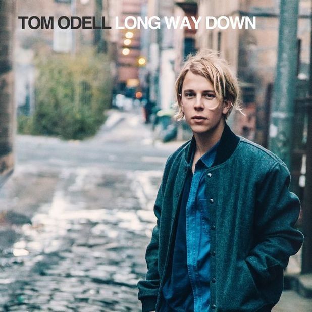 The artist is oddly not centered in this album cover, in contrast to many other album covers he is placed to the right in the framing of the photo. While he is posed to look straight at the camera he has his hands in his pockets in a careless manner. This gives the impression that he is a real person like any other and that his music is relatable to the audience. The artist has an almost scruffy, unkept look about him which suggests that he is not bothered about appearances and that his focus is on the messages in his lyrics. This idea is supported with the simple, basic font.
Taylor Swift Digipak Cover:
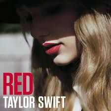 This album cover features a close-up of the artists face, there is nothing else on the cover with the exception of the title and her name. Half of her face is cast in shadow and the photo has been desaturated in contrast to the bold connotations of the title 'Red'. The way the artists head is lowered with her eyes down almost suggests that she is disconnected from the audience, distancing her from the consumer. This sets a more serious tone to her music than in previous albums.
Owl City Digipak Cover:
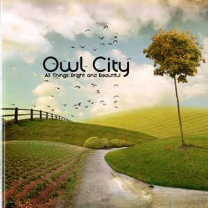 This album cover feautures no artist or model but a landscape setting which contrasts with the name of the band - Owl City- owls are nocturnal animals which holds connotations of nightlife, so you might expect a city scene set at night, featuring skyscrapers lit up . Instead they have used a very natural, idealistic setting without a single person or man-made object insight, presenting an uncorrupted world.
No comments:
Post a Comment