Wednesday, 7 May 2014
Tuesday, 22 April 2014
Monday, 21 April 2014
Wednesday, 16 April 2014
Tuesday, 15 April 2014
Final Tour Poster - Ancillary Task
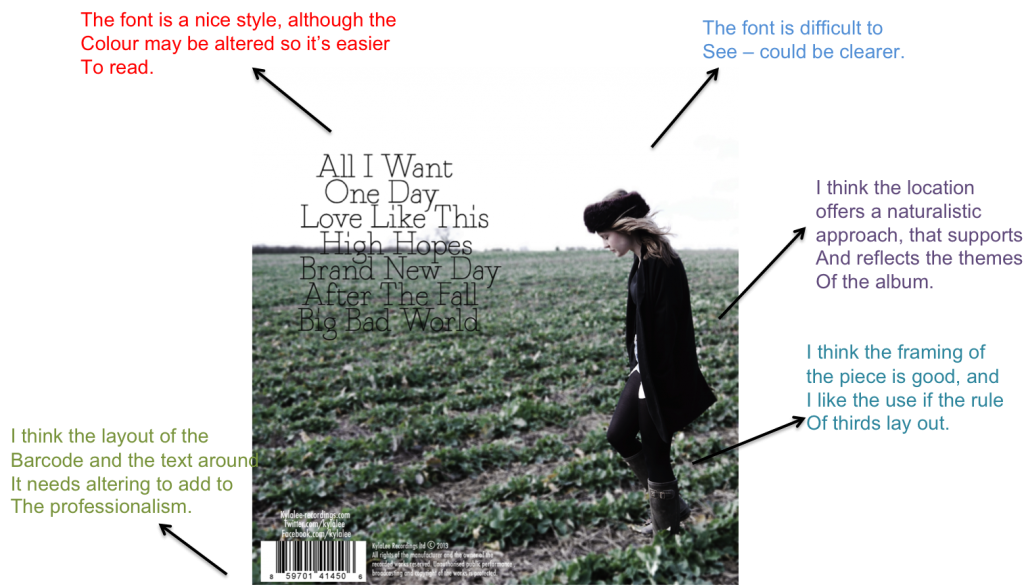
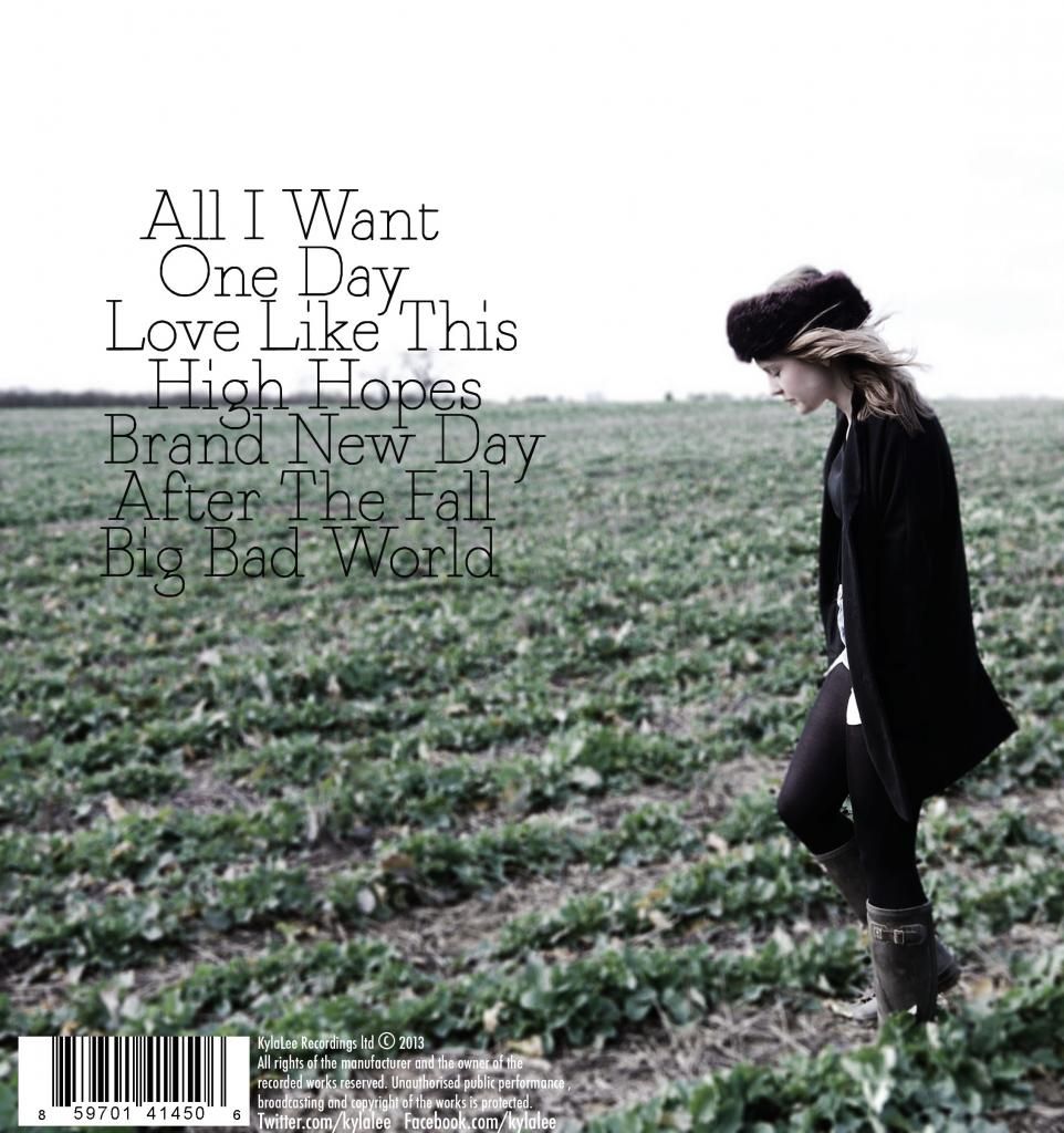
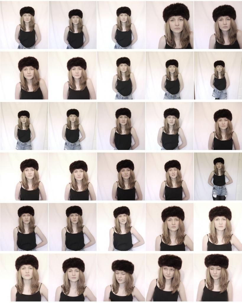
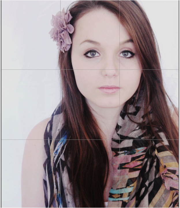
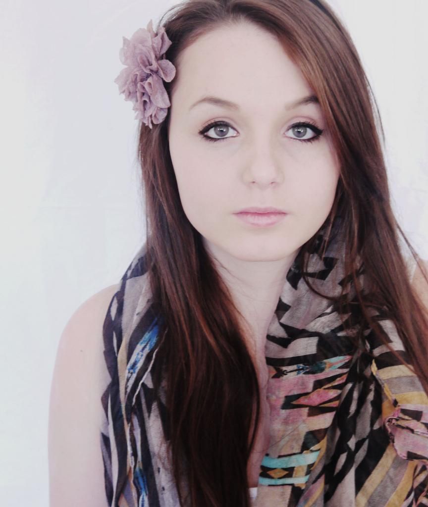
This is our first experimentation at producing a tour poster to support the DigiPak. Originally, when planning the shoot - we decided to utilise imagery against a blank background (in this case a white sheet) for the focus to addressed directly on the model, we also decided that this also left enough available space for the text to be positioned around the model, including the Artists name, album and tour information. Therefore, when shooting our photo shoot, we considered this decision to go ahead and create two separate contact sheers - one for the DigiPak imagery and another for the tour poster. However, having following through with our original design idea to create this experimentation we felt not enough consistency was created between the house styles of the DigiPak and the tour poster. The digipak imagery portayed natural and a sense of freedom as they images were taken outside, whereas this was not the same within the tour poster - as only the prop of the hat was the consistent. Therefore, we addressed the issue and decided to revert back to the DigiPak contact sheet to then choose an image for the tour poster so that a house style effect was created.

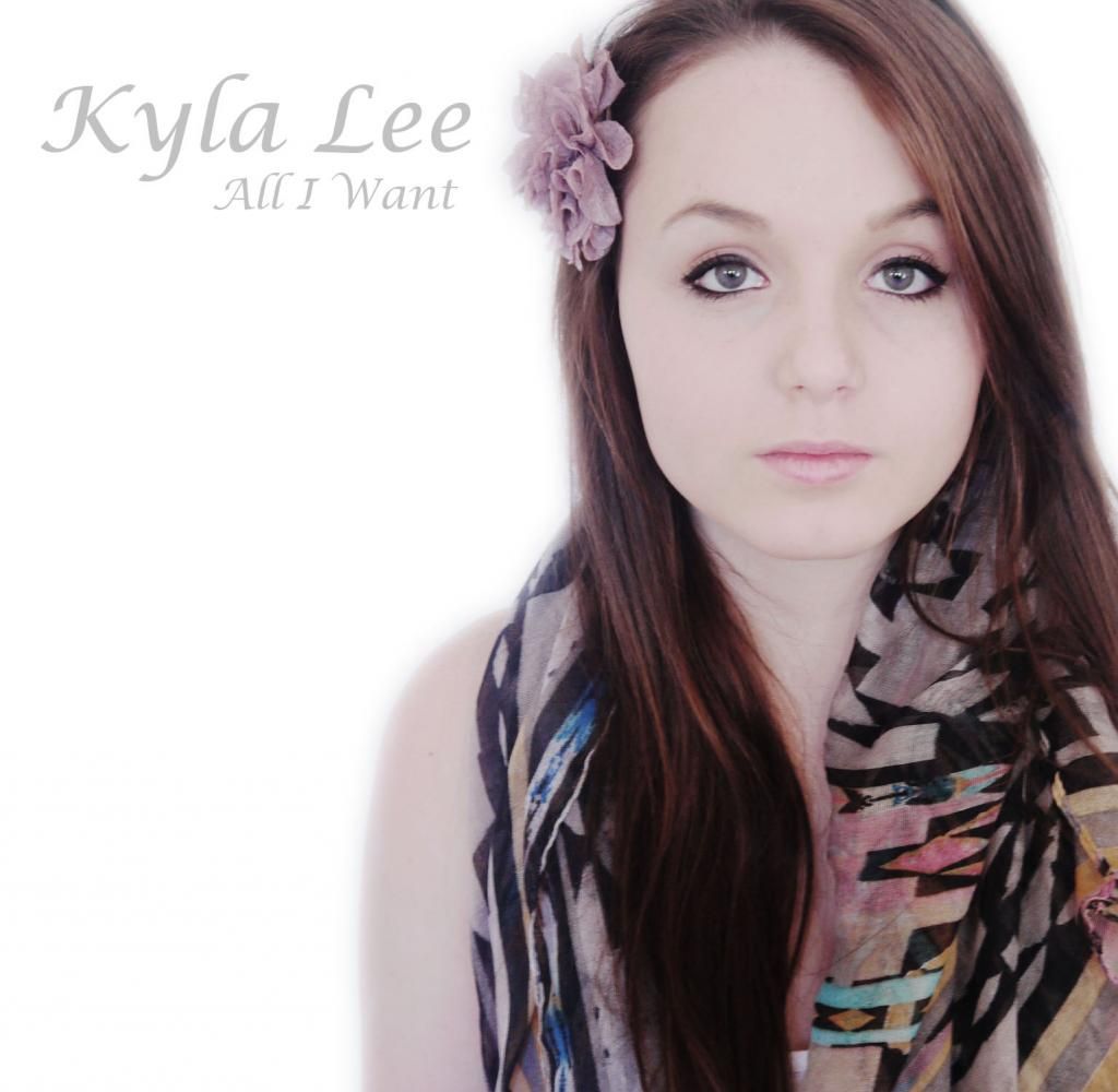
This is our final production of the tour poster, in which presents close imagery to that of the DigiPak so that themes and familiarity for audience members is created. We then presented this re-design to audience members who informed of a remarkable difference, including a 'better sense of connection and theme' and 'recogniseably connected to the DigiPak' all of which, we intended to re create.
Tuesday, 8 April 2014

Friday, 4 April 2014
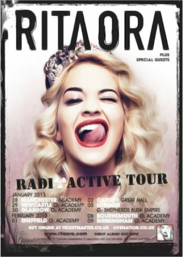
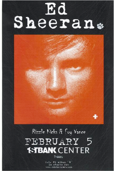
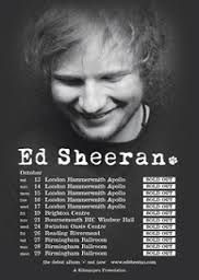
Initial Thoughts For Tour Poster
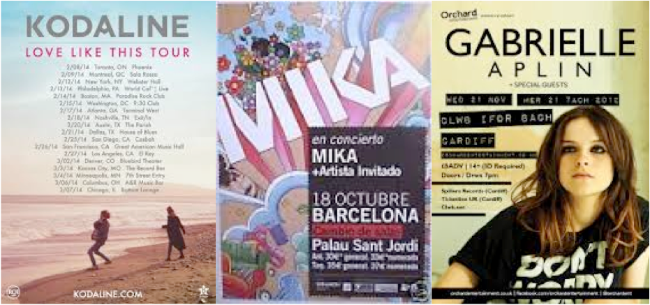
After conducting research into existing tour posters, we have decided to create a tour poster featuring the artist as the main focal point. We also plan to create consistency between the Digipak and the poster so that there is a link between the two.
Shot Planning
We intend to consider these shot plans when taking pictures for our ancillary task, this will enable us to retrieve a variety of different shots which we can then experiment with on Photoshop. We also need to consider the framing of the shot when taking the images due to the layout of the text which we will put on the poster. When taking images for the experimentation of the Digipak this was something we did not take into consideration and as a result the framing of the shot was unsuccessful.
Thursday, 3 April 2014
Tour Poster Plan
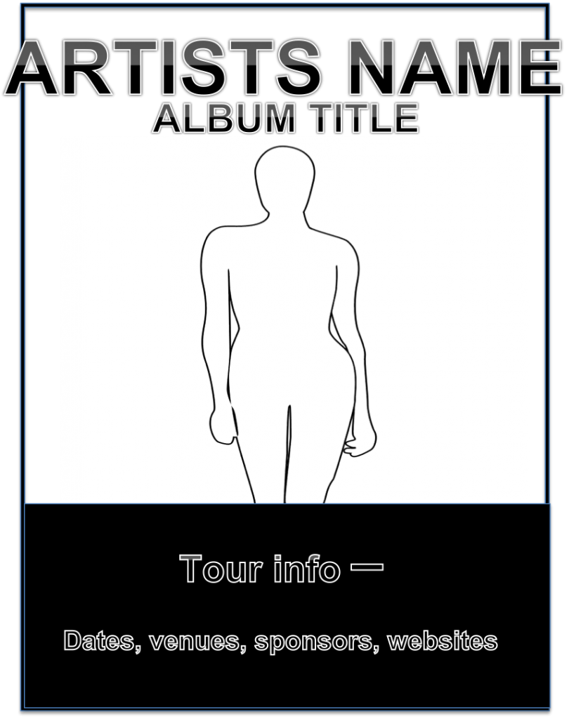
We completed a layout of the design we intend to produce for our poster. This considered the results from our target audience questionnaire. The audience preferred tour posters to utilise a frame in which the image dominated rather than the text, as a result we have decided to make the image the main focal point of the poster and the text will be positioned above the artists head and at the bottom of the frame. We also plan to experiment with a range of pastel colours, monochrome and cold colours - once we have developed three experimentations we plan to present them to our target audience for them to give us feedback. We also plan to use the same fonts as are the digipak so that a link between the two ancillary task is created.
Wednesday, 2 April 2014
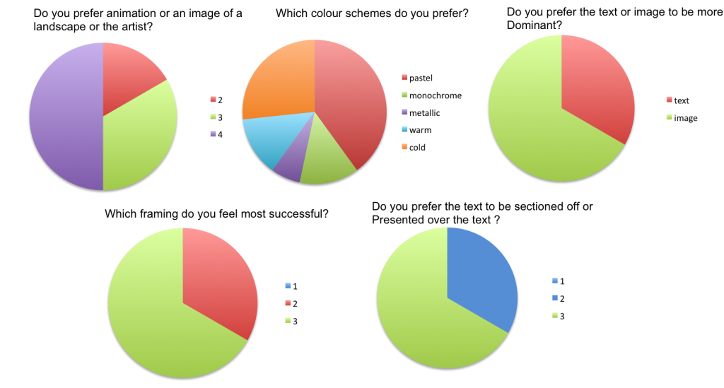
Tour Poster Questionnaire
Questionnaire Sample:
1) Do you prefer animated or an image of a landscape or the artist?
(Here are 3 examples, please state your preference)

2) What colour schemes do you prefer?
(Please circle all that apply)
Pastel colours Monochrome Metallic Warm Colours Cold Colours
3) Do you prefer the text to be dominant or the image?
Text Image
4) Which framing do you feel is more successful?


5) Do you prefer the text to be sectioned off or presented over the image?
(Here are 2 examples, please state your preference)


1) Do you prefer animated or an image of a landscape or the artist?
(Here are 3 examples, please state your preference)
2) What colour schemes do you prefer?
(Please circle all that apply)
Pastel colours Monochrome Metallic Warm Colours Cold Colours
3) Do you prefer the text to be dominant or the image?
Text Image
4) Which framing do you feel is more successful?
5) Do you prefer the text to be sectioned off or presented over the image?
(Here are 2 examples, please state your preference)
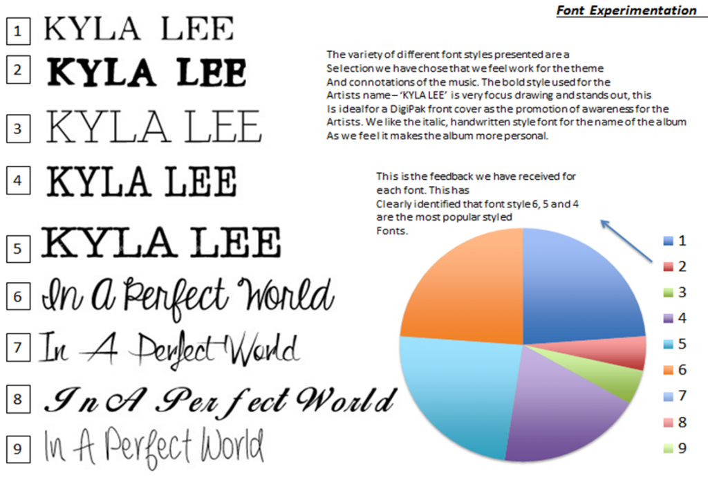
Font Style Analysis
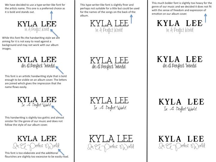
This is our evaluation of different and possible font styles we could utilise within the ancillary tasks of our production. We conducted research, by presenting our target audience numerous fonts to which they had to pick their preference for both the artists name and title of the album. The fonts presented in the document are the options we presented.
We finalised our decision and decided to use the second one down on the fist column within our ancillary tasks.
Thursday, 20 March 2014
Thursday, 27 February 2014
Almost finished production
This is all of our footage put together, however we are now working on the synchronisation of the music with the video, we plan to make the change in notes and lyrics simultaneous with the visual stimuli on the screen.
Thursday, 13 February 2014
Experimentation of DigiPak
Front Cover:
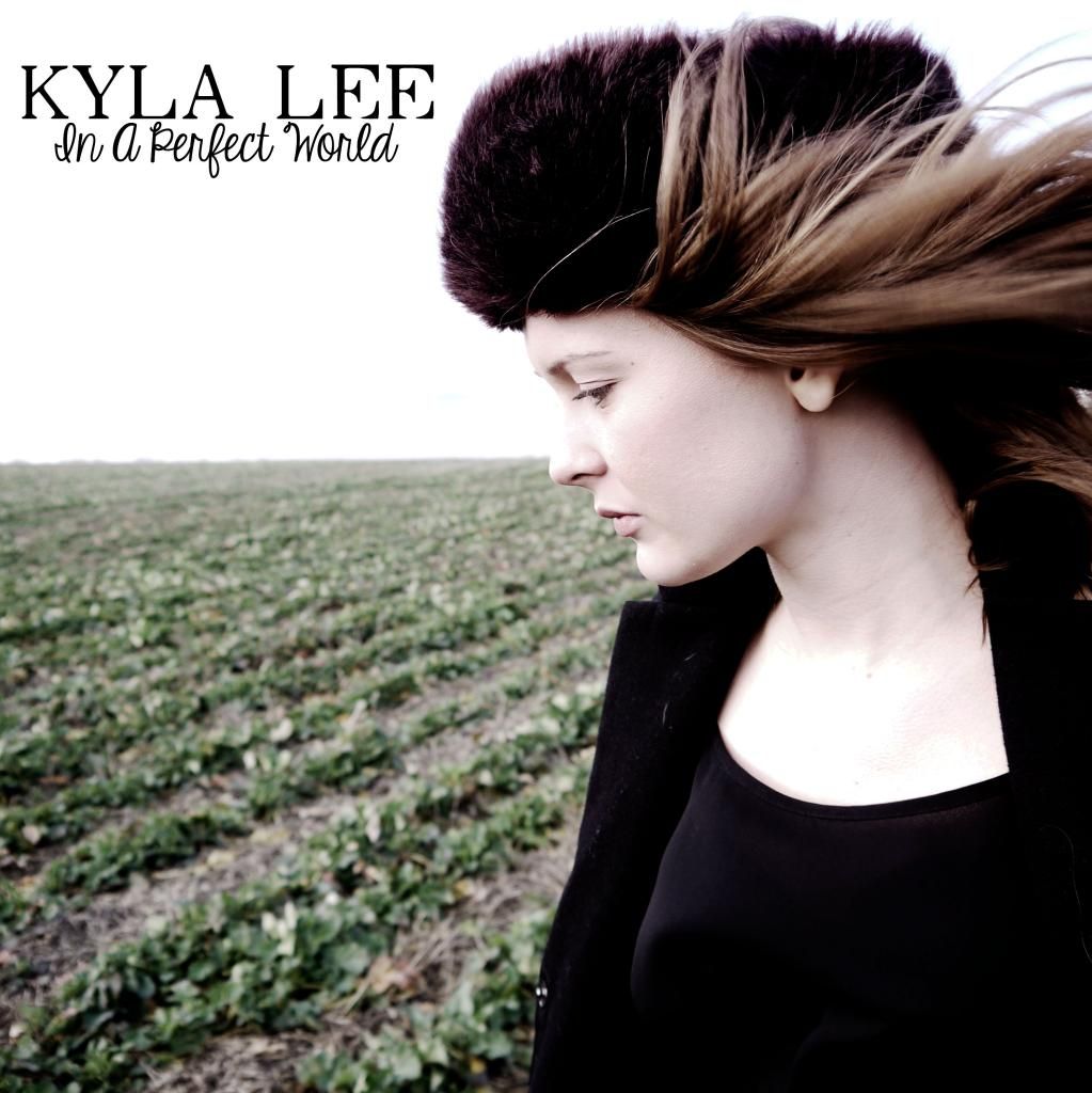
We presented this front cover proposal to our target audience, along with the style model of Gabrielle Aplin's DigiPak for 'English Rain' to receive feedback. General response suggests that the front cover of the the DigiPak is successful as it captures the themes of reservation and loss also present in the music video.
Lyric Insert:
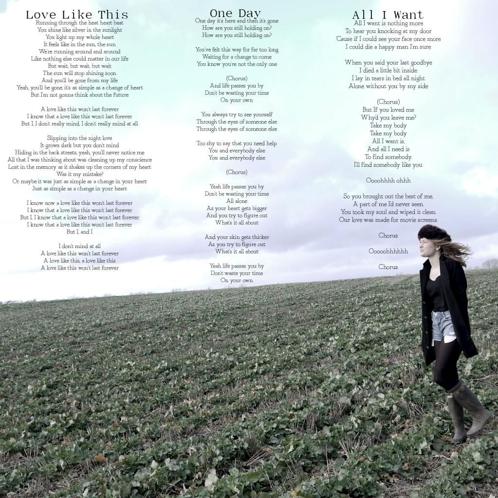
Image Insert:
Back Cover:
Monday, 10 February 2014
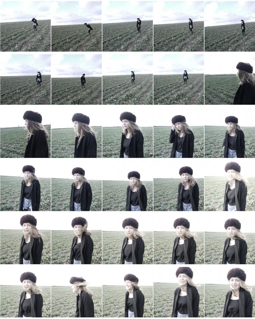
Ancillary Task Contact Sheets
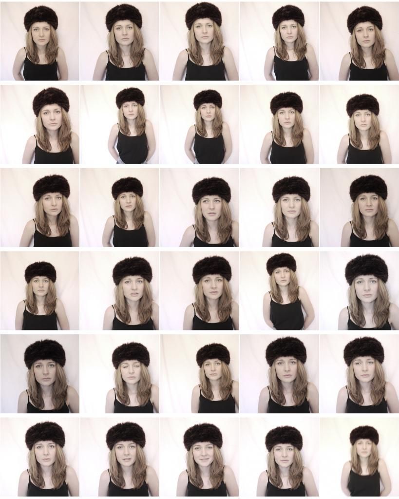
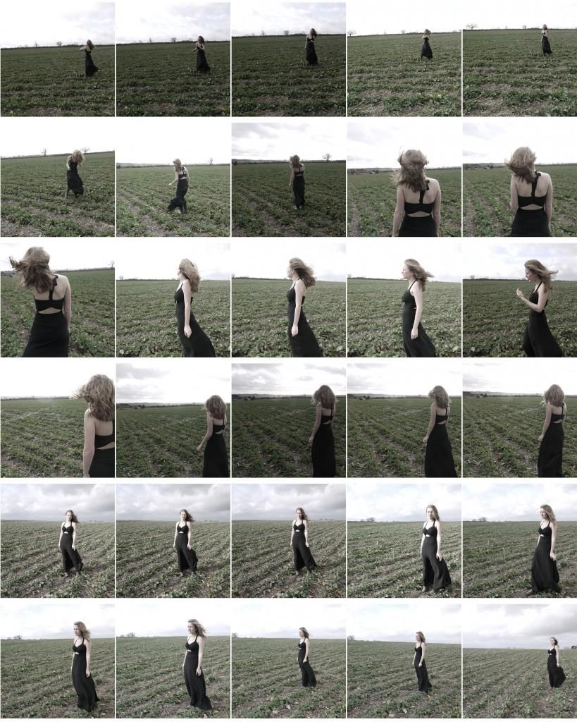
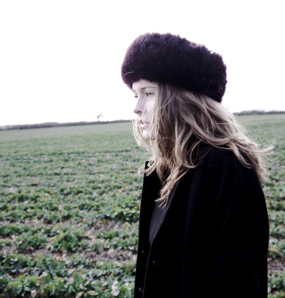
This a few contact sheets that summarise the photoshoot. I decided to take a huge variety of shots, including two out fit changes so that i could collect more material. In some shots the model is wearing a long black floaty dress, that represents the mourning and loss within the music video - almost representing a funeral dress. The second outfit involves the model wearing a big hat, in winter coat.
I also took a series of indoor and outdoor shots using the same outfits, i plan to experiment with both of these different shots which i plan to use for both the digipak and the poster.
Sunday, 9 February 2014
Friday, 7 February 2014
Thursday, 6 February 2014
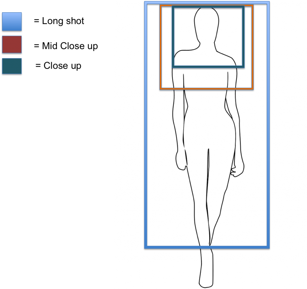
Shot List
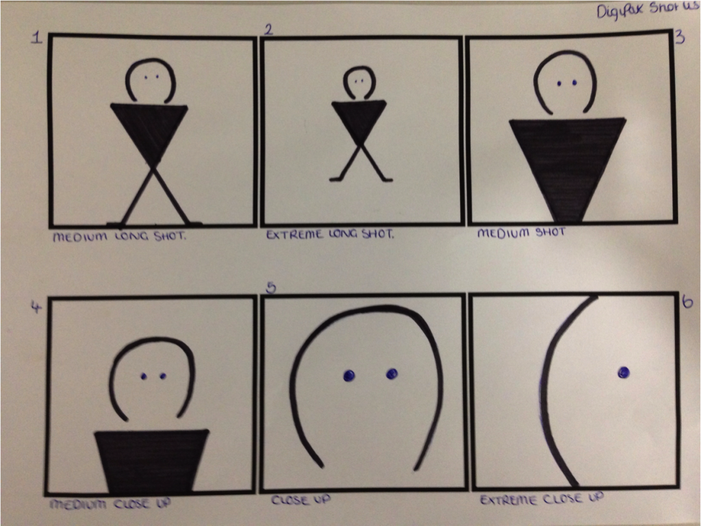
We plan to use a variety of shots in the production of the DigiPak so that we demonstrate our understanding and knowledge of a range of shot set ups. Shot 4 - a medium close up and shot 5 - a close up shot are the types of shots we plan to experiment with for our front cover of the DigiPak. This is because we feel these types of shots encourage rapport building with the audience and the model featured. These shots show very little background allowing the frame to concentrate on the focus of the models face and specific details. This increases the intimacy of the shot as the true emotions of the artist are represented, which means the audience in this case provide sympathy, and they are enabled to understand what the model is feeling, therefore enabling a sense of relationship building. This would ideally represent the genre of the music video and narrative as themes of sadness and loss would be portrayed. For the back cover of the DigiPak we continue to add to this genre connotations through the use of a medium long shot or an extreme long shot - as presented in frame 1 and 2. These shot types allow for a full length shot of the model with the emergence of background and a sense of place. Due to the realistic shot, the audience will be presented with not only focus on the model but also the surroundings in which she is in. We plan to use this type of shot, where the model is standing alone in a field/ country side setting, we aim to achieve this to attempt to portray the loneliness and isolation that the protagonist in the music video now feels, further indicating the theme of loss.
Mise - En - Scene:
We want to achieve the images on the front and back of the DigiPak with as much natural and natural looking light as possible Although we are aware that location and resources are difficult in the close up shots of the model, we would like to use natural lighting so that the shadows upon the artists face are soft. The image on the back of the DigiPak will also include natural lighting and we plan to experiment with sunlight and white light of a cloudy day.

For the inside of the DigiPak we then plan to experiment with candle light and fire. We have decided to use candle light rather than the use of model face shots, so that we still attempt to keep shot variety different. The flame of a candle can be interpreted to suggest the fragile state of the relationship of the two protagonists.
Monday, 3 February 2014
Action Plan For Ancillary Photoshoot
03/02/14: I plan to shoot a second photo shoot working from plans and feedback of the pilot attempt. I plan to create a contact sheet of images so that i have lots of variety of shot types, from extreme close ups, to medium long shots, so that i can chose the best type of shot for our production. The shots will include the model standing in front of a white screen so that upon editing, the background is easier to manipulate. The model will be wearing a pastel pink or white coloured top with a similar coloured flowers in her hair. Her makeup will also be natural and subtle so that we continue to create a look of vulnerability and loss, so that any harsh eye makeup will not withdraw from this. I then will take shots of the model looking directly into the camera but also shots that appear more natural, such as the model looking else where and positioned to the side so that the face is side on. I will also consider, after feedback in the pilot shoot, space for text within the frame. As we intend to employ the rule of thirds concept, we need to leave room above the head and to the side so that we are allowed to proportionally fit the artists name and song title in the frame, without cutting anything off.
However, unfortunately the protagonist used in the final draft of the music video is no longer available for our media use due to unforeseeable circumstances, which means we cannot use her in the anillary tasks. Although this is a huge disadvantage we intend to take the exact same shots, and use the same plan for the model previously used in planning. Therefore, despite the model being different the shots would have had the same outcome.
However, unfortunately the protagonist used in the final draft of the music video is no longer available for our media use due to unforeseeable circumstances, which means we cannot use her in the anillary tasks. Although this is a huge disadvantage we intend to take the exact same shots, and use the same plan for the model previously used in planning. Therefore, despite the model being different the shots would have had the same outcome.
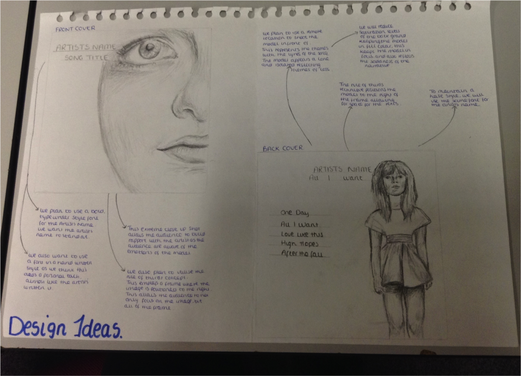
Front Cover Proposal
This is our first design idea for the album cover.
It adopts the rule of thirds concept, which arguably emphasises the power and meaning behind image framing, by following an invisible 3x9 grid behind the art. By having the model pushed to the right hand side of the frame it not only enables the audience to become observational of the entirety - rather than being focused on a set feature - but it also represents the lyrics and narrative of the music video. Due to there now being space to the left of the model in the frame, it suggests that there is something missing that used to be there before, this relates to the narrative as the protagonist has lost her loved one. This is also further suggested in the way that the title of the song 'all i want' is further away from the model, this also may indicate that all the protagonist wants has been taken away from her, her loved one is no longer here and so 'all that i [she] wants' is not hers anymore. However, due to criteria purposes, we are aware that we are assessed on editing skills. This means that by leaving space of whiteness in the frame we could potentially lose credit as we are not taking full advantage of the whole frame. To overcome this we have decided to either use Photoshop to manipulate and edit a back ground into the shot, this may include brush effects - such as smoke or blur, so that we demonstrate and portray editing knowledge. Or alternatively, we could potentially 'zoom in' or take an image that is more closer, intimate and bigger so that more of the frame is filled.
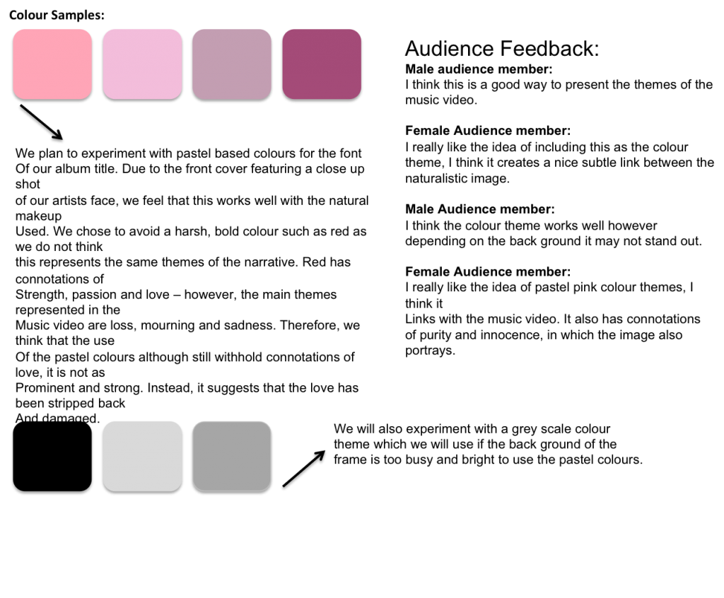
We also plan to use a colour theme of pastel pink pinks, which will be presented in the Artists name and also in the models clothing and makeup. We have chosen this as despite red being represented as the theme of love, passion and romance all of which are found in our music video, we feel that because the couple aren't featured on the front cover, we needed to represent other themes also significant such as loss and innocence. Therefore, the pastel pinks represent a love story stripped back of all happiness, and therefore the colour red with connotations of passion, has faded.
Friday, 24 January 2014

Thursday, 23 January 2014
Wednesday, 22 January 2014
Lip Syncing Analysis
Nina Nesbitt is a a Scottish singer song writer, best known for her single 'stay out' that peaked at number 21 in the UK Singles Charts in 2013.
The music video opens with an establishing, long shot of Nina Nesbitt with her guitar. This immediately suggests to the audience what kind of genre Nina Nesbitt's music is. Rick Altmand suggests that genres are usually defined in terms of media language - the semantic elements - and the codes, ideologies and narratives - syntactical elements. In this case, the fact Nesbitt is positioned with a guitar, in quite casual clothing suggests that the artists is a singer songwriter supporting the acoustic/ pop genre. The camera then zooms to a close up shot of the artists hands playing the guitar to further establish the genre. This may also suggest an ideology of Nesbitt, as because the camera does not straight away focus on her it may indicate that the artist is more for presenting her music rather than promoting herself. Her playing of the guitar lasts only for a few seconds, and is in complete sync with the opening chords of the song. The pace of the music is very quick at this point, and the jump shots of the camera reflect this in a synchronised manner to keep up with the fast pace.
The camera then presents a mid close up of Nesbitt sitting at a dressing table, this time without the guitar. This adds to the variety of the music video and allows the audience to not only appreciate her music ability but also her as a person. This also gives time for the audience to build rapport with the audience. This is something we want to include in our own music video, as we think it strongly supports the narrative. This idea is also enhanced as the artist begins singing the song, whilst in the same shot as the narrative sequence, instead of the music video jumping from the lip syncing scenes and the music video narrative. Although this works for this music video, we cannot achieve this for our own as our main protagonist/ artist is singing the song whilst reflecting upon a memory of her relationship. Instead, to add to synchronisation, we intend to cross dissolve the shots of her lip syncing with the narrative sequence.
For shots the returning mid close up shot of Nesbitt and her guitar
Action Plan For Lip Syncing Shots
We have made the recent decision to alter our music video slightly so that it now includes lip syncing rather than being solely narrative based. We received feedback that included that because the narrative based draft had no 'artist' present and only featured two protagonists, the inclusion of an 'artist' figure in the ancillary task then created confusion, as the audience did not understand who this character was and therefore, synchronisation between the two products was not apparent. We decided that the female protagonist within the music video, should also double as the artist in order to reduce confusion.
In references to the uses and gratifications, the audiences feedback may represent this. This approach focuses on why people use particular media and it's content. Katz, E, 1959 stated that media audiences are active rather than passive and that they take on a role in interpreting and integrating media into their own lives. The basic model of Uses and Gratifications is that media fulfills four factors for the audience.
One of these factors is 'Identify' - this refers to being able to recognise the product/ person presented to you in order to 'role model' them and gain a sense of rapport. This may be where our music video fell down in the audiences eyes, as because of the confusion, the audience did not know who to connect with and therefore, the relationship with the audience and the artist did not succeed. We need to make sure that the audience are able to connect properly to the protagonists and the artists so that a personal relationship can be established.
We plan to shoot the lip syncing scenes using mid close up, close up and extreme close up shots.
This will also enhance the rapport building of the artist and the audience, as the artists facial expressions will be completely exposed allowing the audience to emphasis.
Tuesday, 21 January 2014
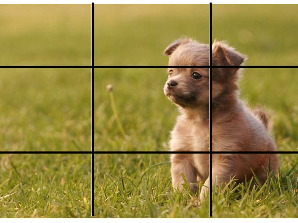
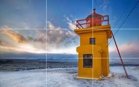
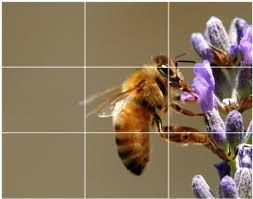
Rule Of Thirds
The rule of thirds is a guideline, first proposed by John Thomas Smith. This guideline applies to the process of visual imagery and design composition. It proposes that an image should essentially be divided into nine equal parts in a grid format, and that important elements of this should be placed along these lines or the intersections. The rule of thirds technique suggests that by aligning a subject at these points, the image is enhanced in terms of tension, energy, interest compared to the standard centering of an image.
These are three examples of imagery that follow Smith's guideline:


These are three examples of imagery that follow Smith's guideline:
When researching further into the technique, we soon established that the positioning of imagery in line with the frame work, images become more powerful and the audiences eyes are not drawn to particular points, but instead observe the whole image instead of certain aspects.
We then experimented with this on our front cover image, by presenting to our target audience a layout that follows the guideline and one that does not. On feedback we recognised that the image slightly to the right of the of grid was considered more effective and significant than the image positioned directly in the center. We then decided that for our final photo shoot we should consider this when taking the imagery and also upon editing.
On our draft image, we applied the rule of thirds grid, this further taught us that the framing of the shot when first taken is also very important as the main features should ideally line up with the lines. On this draft, the models eye should line up with the lines, however because we did not consider this, it does not work that well.
Friday, 10 January 2014
First Draft Ancillary Task

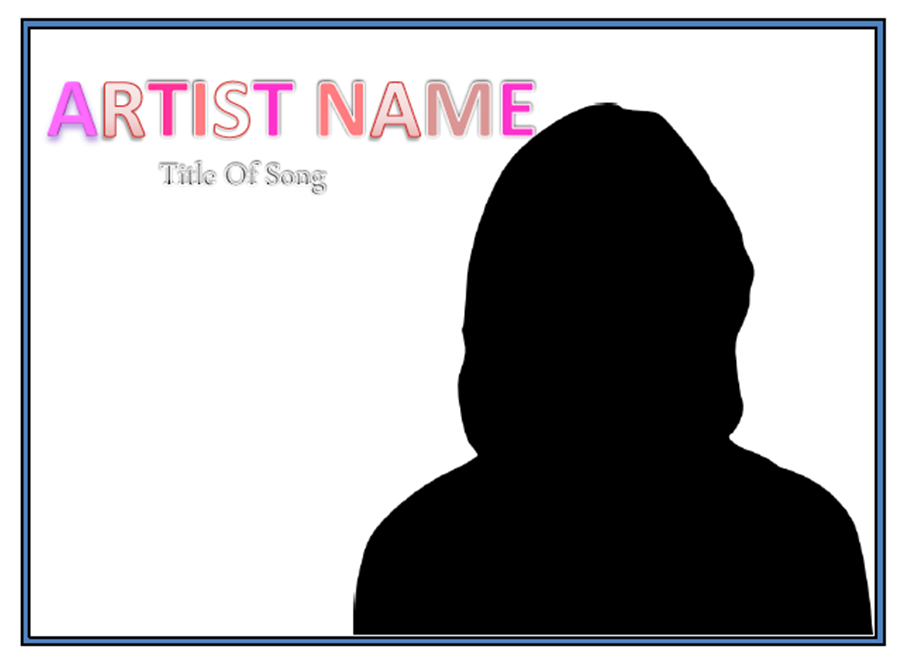
This is our first draft of the album cover. Following research of existing album work we found an image of Gabrielle Aplin that we felt captured the tone of our music video and reflected the narrative line. The image focused upon the artist Aplin, positioned with her hand under her chin, wearing pastel colours with a pensive facial expression, like she is reminiscing of a story she has to tell. This became a significant analysis of the art work as it is exactly what we wanted to portray through our model - we planned to express to the audience that the model on the front cover has been through a journey in which the theme of loss is reflected.
For our first draft our music video was entirely narrative based, this meant we chose to use an 'artist' not introduced in our music video.
When referring to the mise - en - scene of the shot we wanted to also create a pastel based colour scheme, similar to the Gabrielle Aplin style model. We thought this presented her purity almost suggesting she has been stripped back of 'colour' in her life having lost her partner. We also experimented with lighting of the shot - due to lack of resources we did not have a white screen to shoot the model in front of, instead we had to compromise and use a white sheet, this worked fairly well once edited on photoshop. We wanted the lighting to be bright and cold, to also resemble her loss and mourning. Again due to lack of resources, we created light reflectors out of foil wrapped around a white tray to enhance the lighting quality as much as possible. We then experimented with warmer, orangey lighting however decided this did not work and the quality was not up to a high enough standard. Another area in which we wish to change for re-shoot of the front cover was the makeup the model was wearing. We decided that her dark eye liner withdrew from the purity of the shot as it is quite a harsh and took attention away from other areas.
When referring to the framing of the shot, at first we took the photo straight on similar to the Gabrielle Aplin, however upon editing we decided that due to the rule of three divide of the page, by having the image of the model in the middle the audiences attention was only focused upon the models face rather than the artists name and title of the song. We decided that to balance the focus more we should position the model more to the right of the frame with the text above slightly, to the left. When re-shooting we also need to consider room for text, in the original shoot we did not do this and when it came to looking over the images, we realised we had cut the top of the models head off.
A significant change we plan to make for the re- shoot is to change the model we are using. Following feedback from our target audience, we realised by using another model not featured in the music video it created confusion as to who this character actually is. Therefore, we have decided to include scenes of lip sycning in the music video to conclude to the audience who the artist is, this will also be the main protagonist in the music video, who we will then use for the front cover. Once we have created this, we will then ask for feedback again to see whether there is still confusion or whether they feel it has improved.
Thursday, 9 January 2014
First Incomplete Draft.
This is scenes 3-4 and 8-9 of Shannon and Callum together at Wicksteed Park representing the happy couple and a scene later in the timeline where Shannon then returns to the same spot to finish the book alone, and place flowers in his absence. One aspect to our video that we like is the change in lighting to reflect the change in the story line and the atmosphere. In scenes 3 and 4 the lighting is bright and warm with the sun shining however scene 8 and 9 is more dull and cold. this reflects the loss and mourning of which the female protagonist is going through.
12th January Filming
Date: Sunday 12th January
Time: 12:00 - 4:30pm
Location: Leah's House, Rothwell
Scene: 3 - 8
Description/Shots: - Shannon answers the door to Callum who is holding flowers. They hug each other.
- Shannon and Callum roasting marshmellows by the fire, looking happy.
- Shots of the couple sat together laughing.
- Shot of the clock/phone showing the time to be roughy 3:00 am.
- Callums wakes in the middle of the night, sitting up and clutching his side in pain. He wakes Shannon and she looks concerned.
- Shannon helping Callum down the stairs and into the car. Shots of Callum in the car looking worried. Shots of lights passing the car window to show they are travelling
- Shot of Kettering General Hospital sign.
Mise-en-scene: Both wearing casual clothes, jumpers, jeans and leggings etc in the first happy scenes together. Warm lighting as they sit by the fire to reflect a happy and comfortable atmosphere. Then when it becomes night and therefore darker, the two wake in pyjamas etc. We plan to use light reflectors to provide high quality footage that is clear and visible, but also give the impression that it is night time. We will therefore film this during late afternoon when it is becoming darker.
Wednesday, 8 January 2014
First Draft Ancillary Task
Following feedback from our audience members, we have decided that a more effective layout for our album would be to position our artist to the side of the frame, instead of in the centre, with the text positioned above but to the left. Due to the rule of three this means that the audiences focus is both on the picture of the artist as well as the name, whereas before the audiences attention was drawn only to the artist in the middle.
Having also presented this example to our target audience, we also received feedback stating that by introducing another character representing the 'artist' of the music video, it created confusion for the audience as this character was not the protagonist in the video. For this reason, we have decided to feature the protagonist in the music video as the artist. This will include shots of her singing and playing the guitar throughout the music video and also appear on the cover. We received positive responses from the audience when we presented this idea.
Subscribe to:
Posts (Atom)