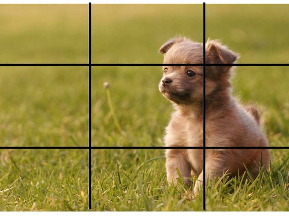
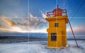
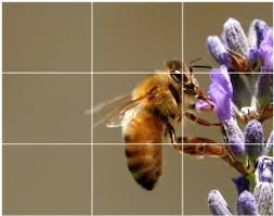
These are three examples of imagery that follow Smith's guideline:

When researching further into the technique, we soon established that the positioning of imagery in line with the frame work, images become more powerful and the audiences eyes are not drawn to particular points, but instead observe the whole image instead of certain aspects.
We then experimented with this on our front cover image, by presenting to our target audience a layout that follows the guideline and one that does not. On feedback we recognised that the image slightly to the right of the of grid was considered more effective and significant than the image positioned directly in the center. We then decided that for our final photo shoot we should consider this when taking the imagery and also upon editing.
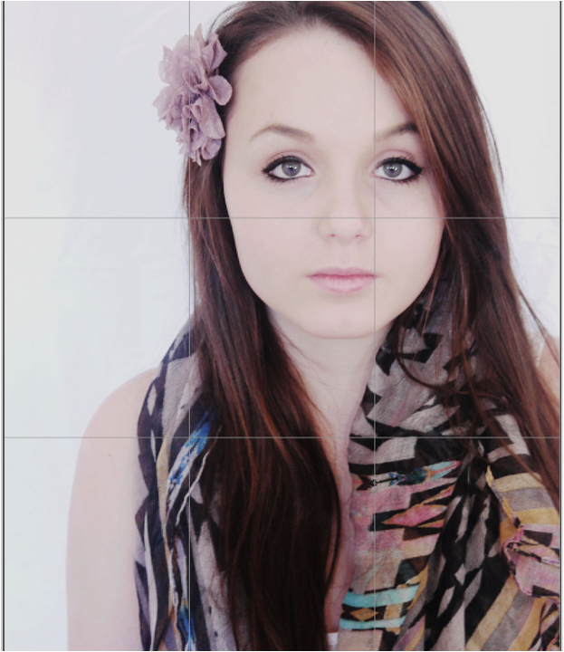
On our draft image, we applied the rule of thirds grid, this further taught us that the framing of the shot when first taken is also very important as the main features should ideally line up with the lines. On this draft, the models eye should line up with the lines, however because we did not consider this, it does not work that well.
No comments:
Post a Comment