Monday 28th October:
Create detailed plan for our next film date, including locations, times and costumes.
Tuesday 29th October:
Carry out our first shooting for our ancillary task to produce an initial set of photos we can begin to edit to create a first draft.
Wednesday 30th October
Begin editing our images for the ancillary task (album cover). Continue research into existing products surrounding album artwork: what is successful and what fits the genre.
Thursday 31st October
Gain audience feedback on our initial draft of our ancillary task and on various fonts we have selected - producing different drafts for the audience to state which they prefer.
Friday 1st November
Following feedback adjust our drafts using
Monday, 28 October 2013
Wednesday, 9 October 2013
Re- Planning
Unfortunately, our male protagonist Reece Coles has broken his knee, we have therefore decided that the quality of our music video will be significantly impacted if we continue to use him due to continuity errors. Our lead role having a broken leg makes no sense to the narrative or raw footage we have previously obtained. As a result. we have chosen to re-film using a different male actor.
Plans to re-film:
We plan to re-film with the new actor on the 21st and 22nd of October. If weather conditions are poor we will film scenes indoor scenes, or scenes that having dull weather/ rain which we will use to our advantage to convey change in atmosphere.
Our new actors will be Ross Mulligan and Shannon Porter.
Ancillary task experimentation
After researching existing products, we decided to experiment with editing images on photoshop. We used an image from Gabrielle Aplin's EP cover as a template to then practice different techniques and effects.
We searched for different brushes on myphotoshopbrushes.com, we then downloaded a selection which we thought met the conventions of our chosen genre and the needs of our target audience.
Once on photoshop we experimented with layering different styles and effects on different layers of the original image.
This is an example of an experimentation we created, using various effects and overlay filters. We've decided that we like the brushes and colours used because it makes the photo more symbolic and eye catching. However, we have learnt that the quality of the original photograph is extremely important because it is the basis of the entire advertisement.
Despite this not being our own photography, we have received positive feedback from our target audience members who like the use of different colours and brushes.
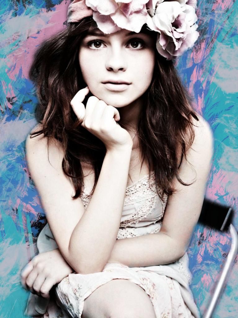
This is our second example of an experimentation we created, again using various effects and overlay filters. Intsead we decided de-saturating the image provided more of an impact and brings focus to the model rather than the background. In our own photography we have decided to include red as a colour theme, where the model wears red props, therefore we want the background to be dark so these stand out better. Also, the darker colours reflect themes within the music video and lyrics.
We searched for different brushes on myphotoshopbrushes.com, we then downloaded a selection which we thought met the conventions of our chosen genre and the needs of our target audience.
Once on photoshop we experimented with layering different styles and effects on different layers of the original image.
 |
Experimentation One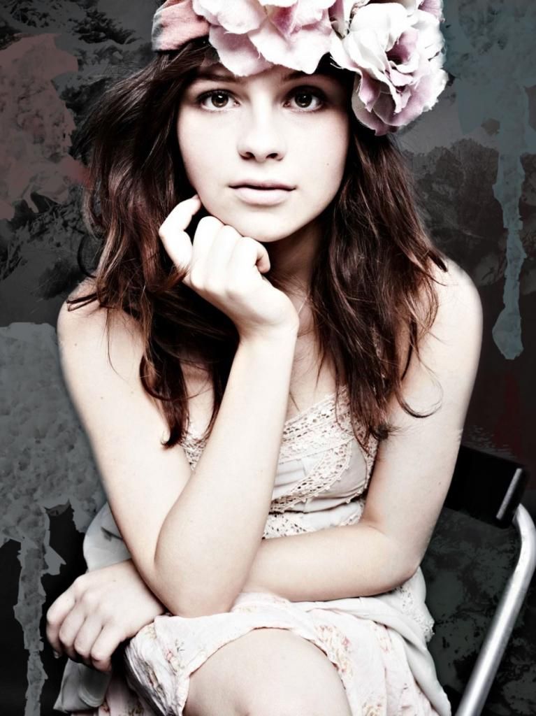 |
This is an example of an experimentation we created, using various effects and overlay filters. We've decided that we like the brushes and colours used because it makes the photo more symbolic and eye catching. However, we have learnt that the quality of the original photograph is extremely important because it is the basis of the entire advertisement.
Despite this not being our own photography, we have received positive feedback from our target audience members who like the use of different colours and brushes.
This is our second example of an experimentation we created, again using various effects and overlay filters. Intsead we decided de-saturating the image provided more of an impact and brings focus to the model rather than the background. In our own photography we have decided to include red as a colour theme, where the model wears red props, therefore we want the background to be dark so these stand out better. Also, the darker colours reflect themes within the music video and lyrics.
Saturday, 5 October 2013
Wednesday, 2 October 2013
DigiPak Artwork Audience Research
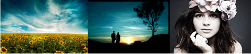
The first people we asked were a group of 17 year old boys. All 3 decided immediately that they preferred the photo of the model because she is attractive. They also liked having the image of the singer/songwriter on the front cover of an album because it is promoting her music and not a well taken photo.
The second person we asked was a female adult. She showed preference for the landscape option because while ambiguous the field of sunflowers has connotations of happiness and romance which reflects the themes within the lyrics.
The third person we asked was an adult male who is also a musician, because of this he had strong opinions of what he feels successful in the music industry. He said that he would not chose either of them because they were too contrived and that he prefers artwork with a more spontaneous and mysterious element rather than artwork that is designed purely to sell.
We then asked a teenage girl who preferred the silhouette of the couple because it clearly indicates the romantic genre. She says she was least likely to pick an album featuring a landscape because it is too generic.
Another girl and a boy that we asked separately said the image of the artist appealed most as it was more relevant to the music and offers more credit to the artist.
The final male respondent that we asked said he preferred the silhouette because it is the most artistic. We then asked whether this would be different if there was no featured couple and he said yes, they made it more symbolic.
..................................................................................................................................................
We have decided following feedback that we intend to use the silhouette of the couple as our main style model. Although this is not the most popular choice, we feel it relates well to the music and lyrics but also the narrative of our music video.
Subscribe to:
Comments (Atom)