http://www.flipsnack.com/musicvideo/fu9a6nkc
Tuesday, 22 April 2014
Monday, 21 April 2014
Wednesday, 16 April 2014
Tuesday, 15 April 2014
Final Tour Poster - Ancillary Task
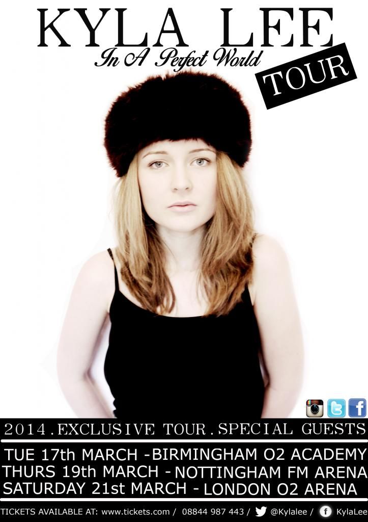
This is our first experimentation at producing a tour poster to support the DigiPak. Originally, when planning the shoot - we decided to utilise imagery against a blank background (in this case a white sheet) for the focus to addressed directly on the model, we also decided that this also left enough available space for the text to be positioned around the model, including the Artists name, album and tour information. Therefore, when shooting our photo shoot, we considered this decision to go ahead and create two separate contact sheers - one for the DigiPak imagery and another for the tour poster. However, having following through with our original design idea to create this experimentation we felt not enough consistency was created between the house styles of the DigiPak and the tour poster. The digipak imagery portayed natural and a sense of freedom as they images were taken outside, whereas this was not the same within the tour poster - as only the prop of the hat was the consistent. Therefore, we addressed the issue and decided to revert back to the DigiPak contact sheet to then choose an image for the tour poster so that a house style effect was created.
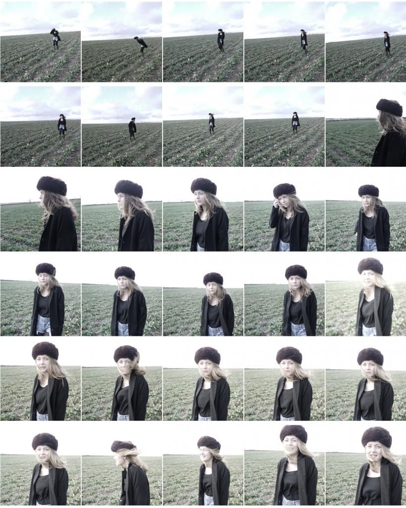

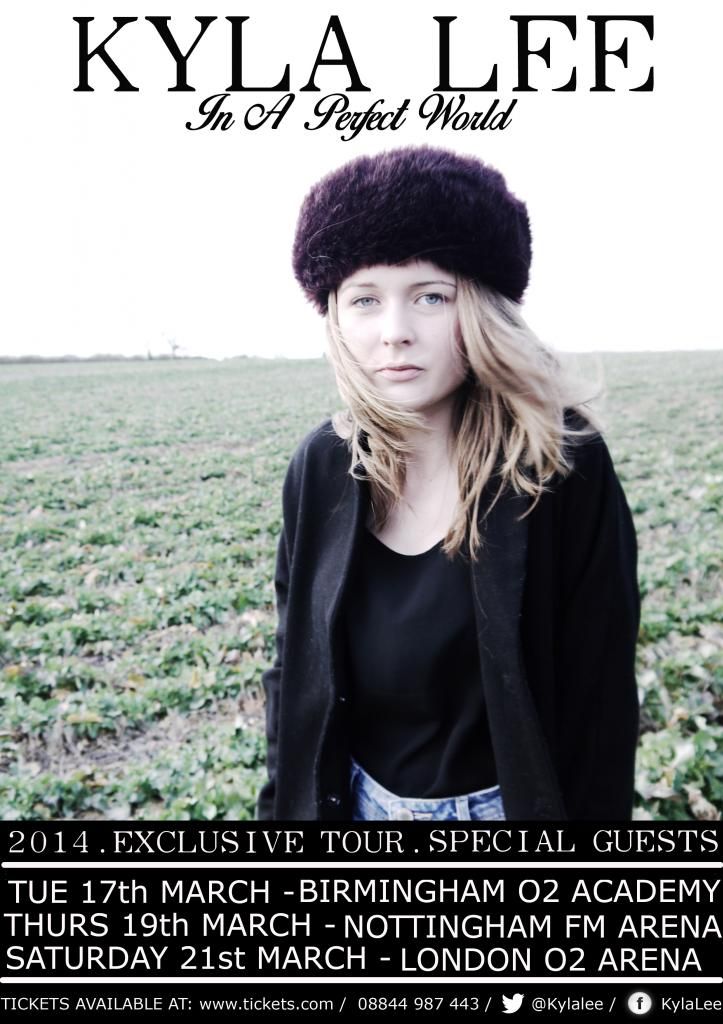
This is our final production of the tour poster, in which presents close imagery to that of the DigiPak so that themes and familiarity for audience members is created. We then presented this re-design to audience members who informed of a remarkable difference, including a 'better sense of connection and theme' and 'recogniseably connected to the DigiPak' all of which, we intended to re create.
Tuesday, 8 April 2014
Friday, 4 April 2014
Initial Thoughts For Tour Poster
After conducting research into existing tour posters, we have decided to create a tour poster featuring the artist as the main focal point. We also plan to create consistency between the Digipak and the poster so that there is a link between the two.
Shot Planning
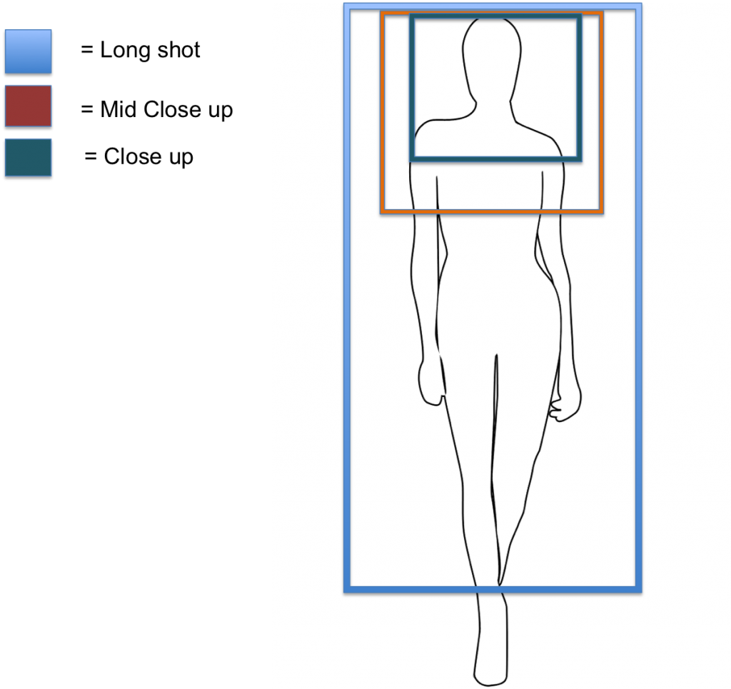
We intend to consider these shot plans when taking pictures for our ancillary task, this will enable us to retrieve a variety of different shots which we can then experiment with on Photoshop. We also need to consider the framing of the shot when taking the images due to the layout of the text which we will put on the poster. When taking images for the experimentation of the Digipak this was something we did not take into consideration and as a result the framing of the shot was unsuccessful.
Thursday, 3 April 2014
Tour Poster Plan
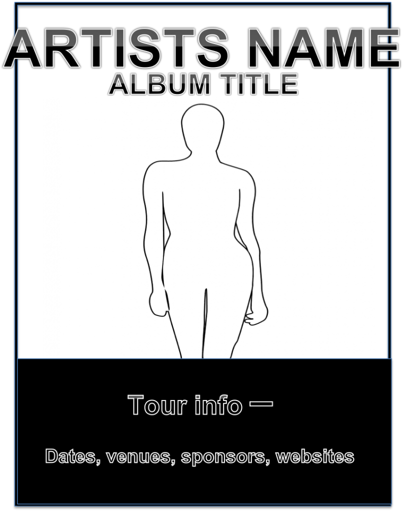
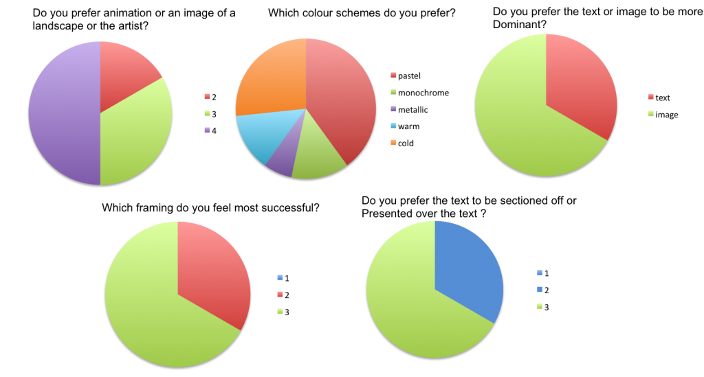
We completed a layout of the design we intend to produce for our poster. This considered the results from our target audience questionnaire. The audience preferred tour posters to utilise a frame in which the image dominated rather than the text, as a result we have decided to make the image the main focal point of the poster and the text will be positioned above the artists head and at the bottom of the frame. We also plan to experiment with a range of pastel colours, monochrome and cold colours - once we have developed three experimentations we plan to present them to our target audience for them to give us feedback. We also plan to use the same fonts as are the digipak so that a link between the two ancillary task is created.
Wednesday, 2 April 2014
Tour Poster Questionnaire
Questionnaire Sample:
1) Do you prefer animated or an image of a landscape or the artist?
(Here are 3 examples, please state your preference)

2) What colour schemes do you prefer?
(Please circle all that apply)
Pastel colours Monochrome Metallic Warm Colours Cold Colours
3) Do you prefer the text to be dominant or the image?
Text Image
4) Which framing do you feel is more successful?


5) Do you prefer the text to be sectioned off or presented over the image?
(Here are 2 examples, please state your preference)


1) Do you prefer animated or an image of a landscape or the artist?
(Here are 3 examples, please state your preference)
2) What colour schemes do you prefer?
(Please circle all that apply)
Pastel colours Monochrome Metallic Warm Colours Cold Colours
3) Do you prefer the text to be dominant or the image?
Text Image
4) Which framing do you feel is more successful?
5) Do you prefer the text to be sectioned off or presented over the image?
(Here are 2 examples, please state your preference)
Font Style Analysis
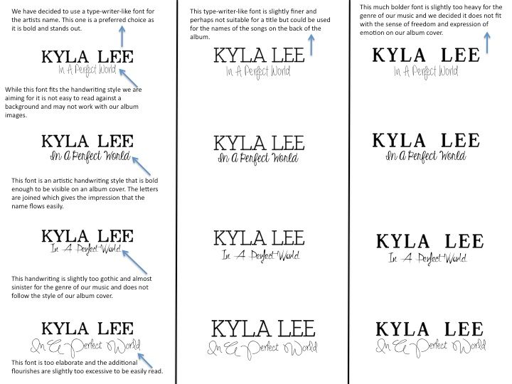
This is our evaluation of different and possible font styles we could utilise within the ancillary tasks of our production. We conducted research, by presenting our target audience numerous fonts to which they had to pick their preference for both the artists name and title of the album. The fonts presented in the document are the options we presented.
We finalised our decision and decided to use the second one down on the fist column within our ancillary tasks.
Subscribe to:
Comments (Atom)