Wednesday, 27 November 2013

Ancillary Task Questionnaire

Gender:
Male = 5        Female= 5

1) Do you prefer album covers that have an image of the artist as the main focus?

Yes = 7          No = 3

2) Do you prefer album covers where the title is...

Big and Bold = 3      Elegant and Italic = 5        Plain and Basic = 2         Other = 0

3) What colour schemes are most successful in the advertising an album of this genre?

Blues = 0       Greens = 0       Monotones = 3       Reds = 3   pinks=  3       Oranges = 1

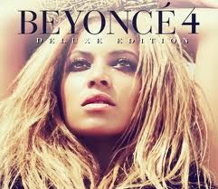
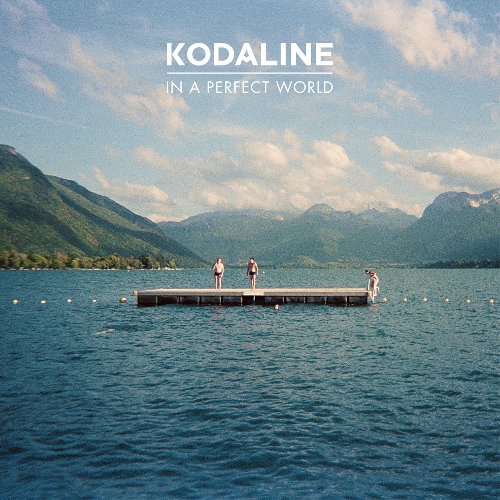
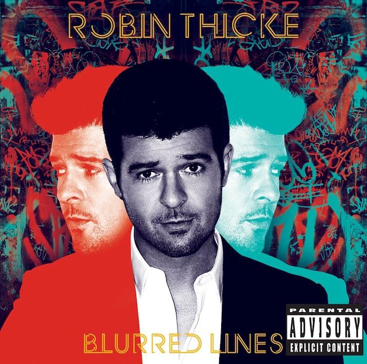
4) Of these two album covers which appeal to your more?

 = 3                         =  7

5) Why?

'Genre conventions, not too 'in your face' and looks more professional'

6)  What kind of setting of the image do you think is most effective?

White studio = 4   Domestic Household = 0  Countryside = 3   Urban city = 0    Edited/constructed = 3

7) Do you prefer the insert inside the album to relate/follow the same housestyle as the images on the album cover?

Yes = 7       No = 2

...................................................................................................................................................................

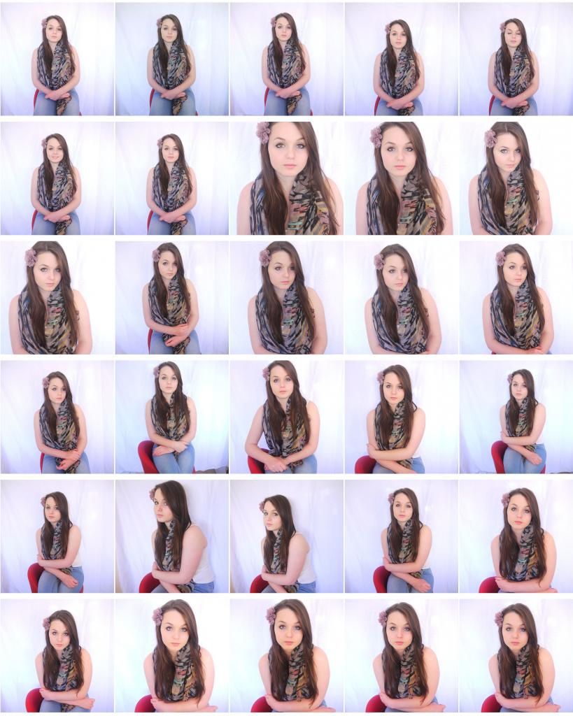
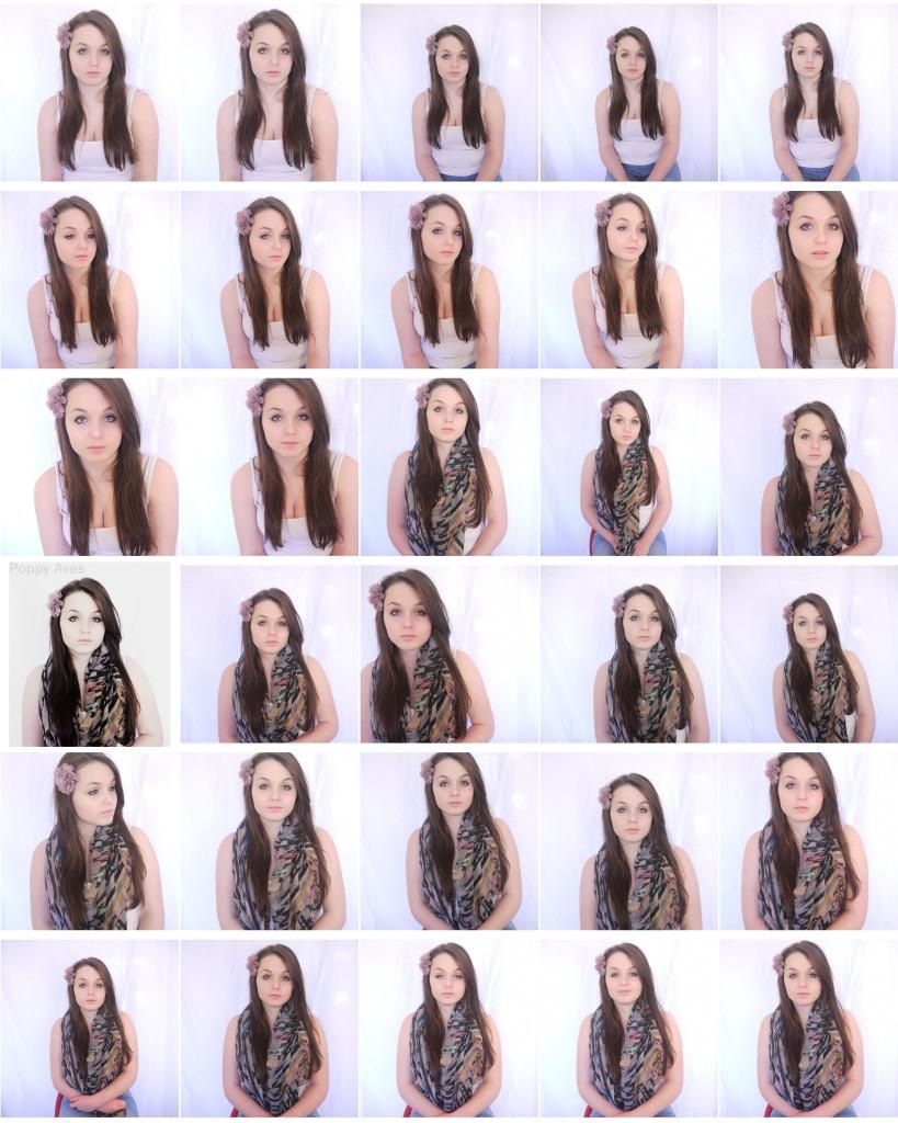
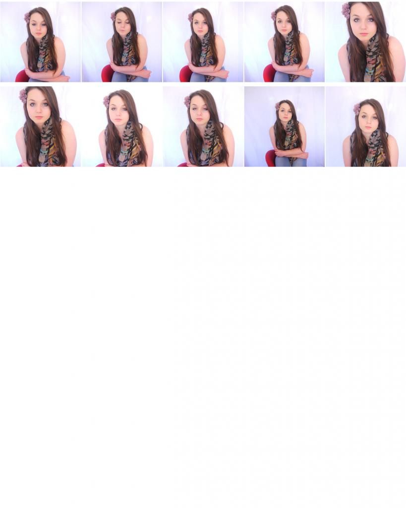
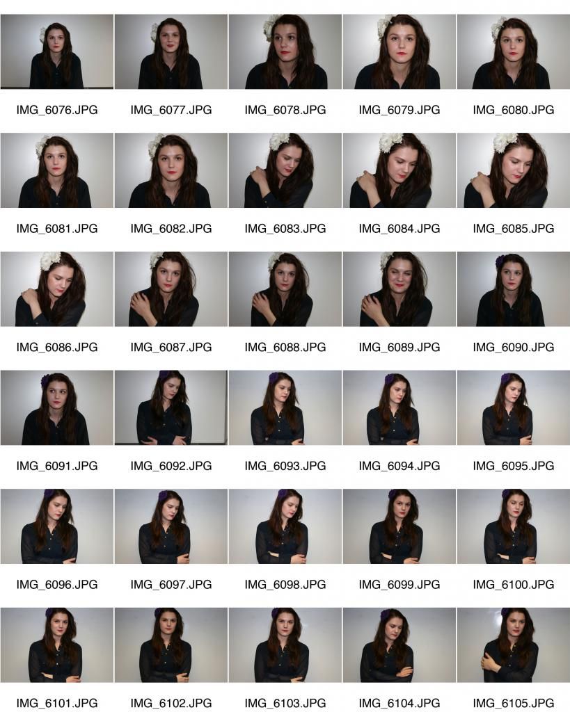
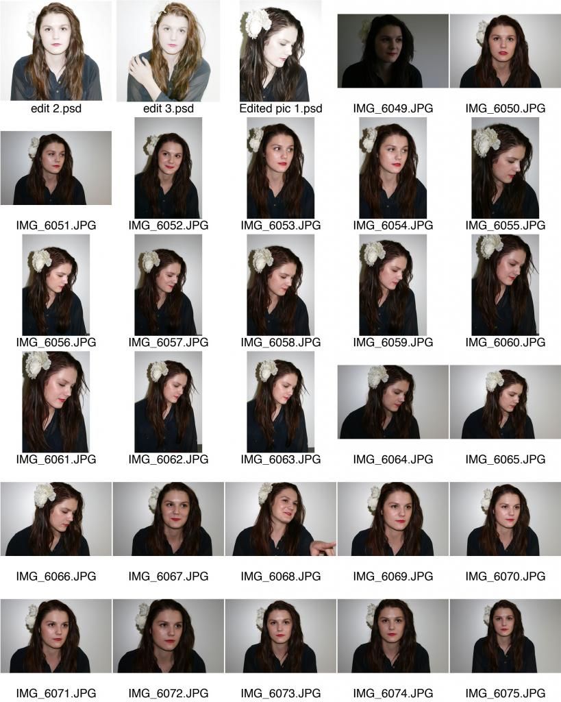
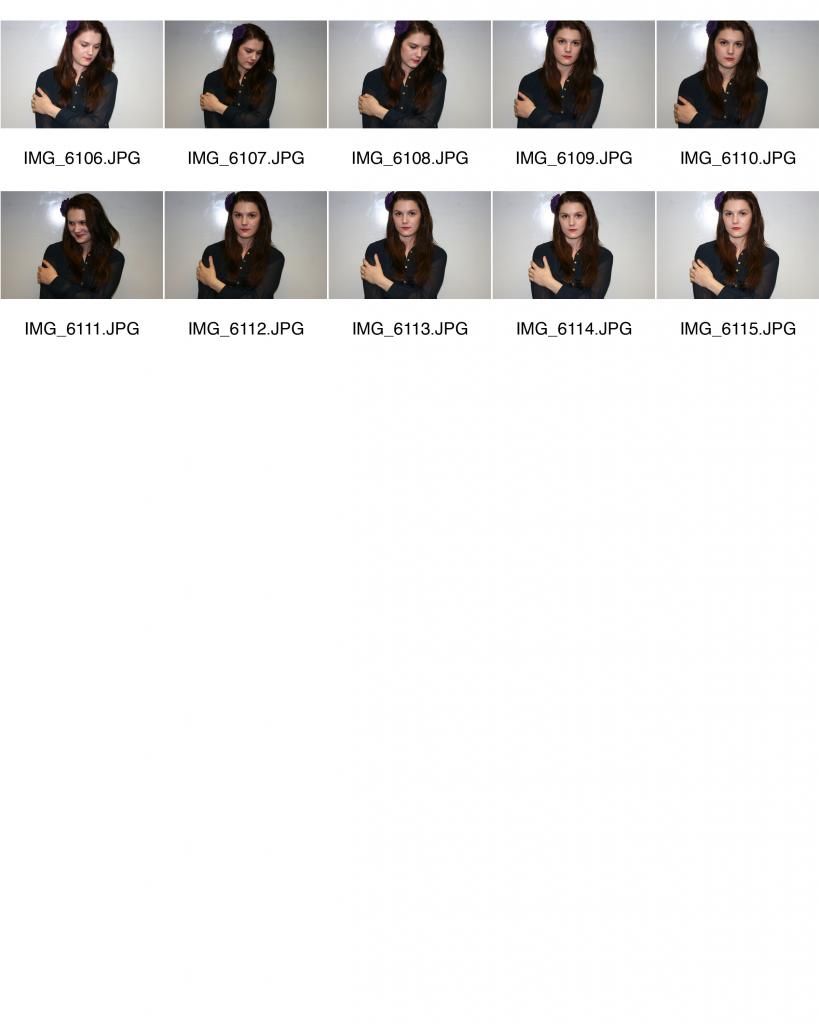
We conducted research into the views of our target audience in relation to album covers. Following feedback we have found a preference for more understated images, where perhaps positioning or facial expression portrays the main theme. We have taken this into consideration when planning our ancillary task shoot - we plan to shoot medium close ups of our chosen model so that she is in focus and so that there is nothing distracting in the background to take away from the artist and the music. 
Following feedback regarding the colour scheme, we plan to shoot a range of shots using different colour schemes in the models clothes and makeup, to which we will enhance in later editing stages. 

Monday, 25 November 2013

Ancillary Task Contact Sheet 2

Based on feedback from our last photo shoot we decided to carry out a second - this time using light reflectors to enhance the quality of the images. This resulted in much brighter photos of a quality we are much happier with. However, we have still learnt many things from this second shoot that we intend to use for a third photo shoot. In these images we found it was difficult to pin point the emotion of the model due to her facial expression and posture. Understandably, we cannot expect her to produce exactly the image we are aiming to achieve as she is not a professional model and is simply helping us with our work by standing in to pose for our photos. We decided that next time it would be more beneficial for her to be sat\stood at an angle and we intend to direct her her so that her posture does not convey that she is uncomfortable or bored in any way and that she is a girl that is growing up but who is in control. We also decided that while her make-up is soft and natural looking, the black eyeliner contrasts with the black and bold colours in her scarf and that this is not soft enough for what we are trying to achieve in order to meet the conventions of our genre of music. 

Plan for our next shoot:
  •  Shoot a variety of different positions, including the model standing and sitting.
  • Experiment with coloured tops, to provide a range of colour schemes.
  • Make sure the model wears softer and warmer make-up to follow genre conventions.
  • Shoot at different angles, we plan to experiment with slightly higher and lower angles, rather than a direct eye contact shot.
  • We need to make sure that framing of the shot allows for text.
  • We intend to achieve the same methods of lighting because we thought this was successful in these shots.

Wednesday, 6 November 2013

Audience feedback

We carried out target audience research into genre conventions of digi-pak  


We carried out audience feedback by showing  our target audience existing album covers of different genres (Gabrielle Aplin, Mika, Beyonce, Robin Thicke) we then asked them a series of questions about which genre they thought the music was, just by looking at the album covers.                                                                               

On general feedback, we found that the bright colours of Robin Thicke and Mika conveyed almost immediately the pop genre. Due to this being a consistent audience response we have decided when editing our photography for our album cover, to reduce saturation and avoid bright, striking colours. We also intend to ask the model to wear pale coloured clothes - white or pink, with a similar coloured flower in her hair to maintain a colour theme. 

We found that the cartoon animation aspect to Mika's album cover appealed to a more younger audience, who liked the 'cool effects', whereas, this actually was something our tsrget age group said they dislike and felt was not appropriate to the genre of the song we are using. 

Beyonce's album cover was the favourite the audience members that we asked. She is the only focus of the cover so there is nothing happening in the background to distract from Beyonce and her music. The angle and position of the model makes the photography very striking and powerful. 

Monday, 4 November 2013

Ancillary Task Contact Sheets

We carried out an initial photo shoot in order to produce drafts of our ancillary task and to allow us room to analyse the quality of the photos. This means we can spot any problems with lighting, positioning or colour and correct this in a second shoot. From looking through the photos we have decided that the dark colour of her top does not work well and plan to have our model wearing a white/pastel colour top in our next shoot. For the next shoot we intend to spend longer before the shoot on hair and make-up so that it does not look like she is just at school - in order to make the photography look more professional.