This is all of our footage put together, however we are now working on the synchronisation of the music with the video, we plan to make the change in notes and lyrics simultaneous with the visual stimuli on the screen.
Thursday, 27 February 2014
Almost finished production
This is all of our footage put together, however we are now working on the synchronisation of the music with the video, we plan to make the change in notes and lyrics simultaneous with the visual stimuli on the screen.
Thursday, 13 February 2014
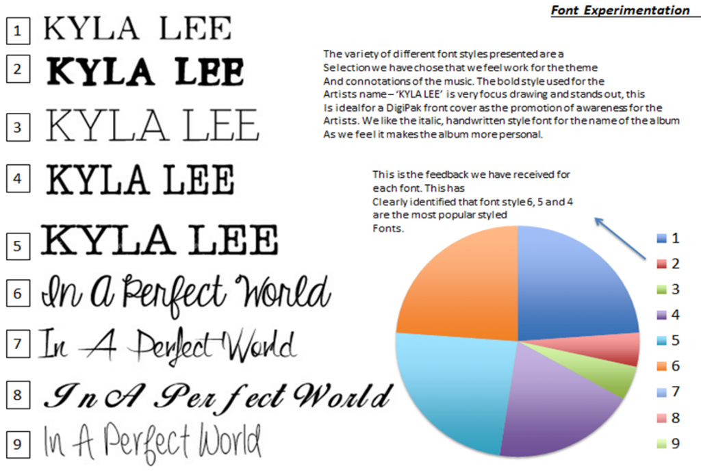
Experimentation of DigiPak
Front Cover:
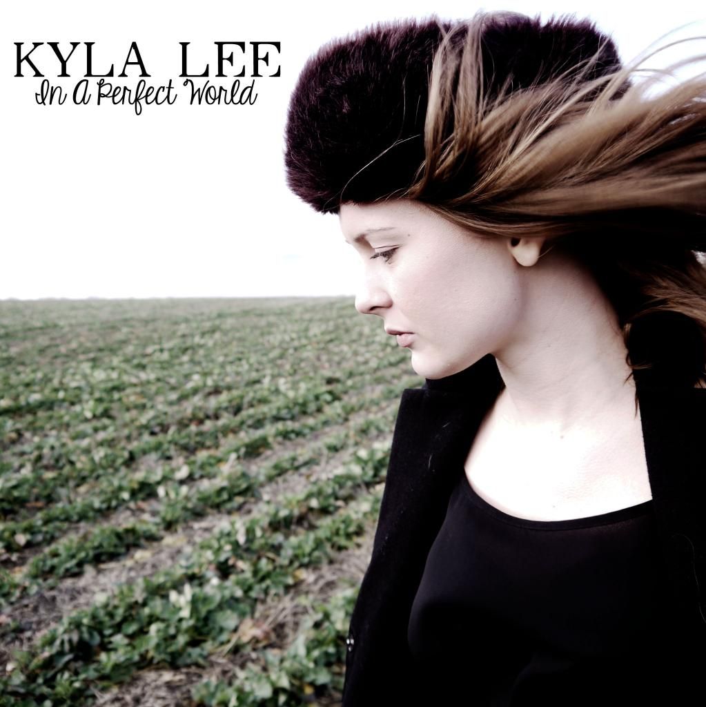
We presented this front cover proposal to our target audience, along with the style model of Gabrielle Aplin's DigiPak for 'English Rain' to receive feedback. General response suggests that the front cover of the the DigiPak is successful as it captures the themes of reservation and loss also present in the music video.
Lyric Insert:
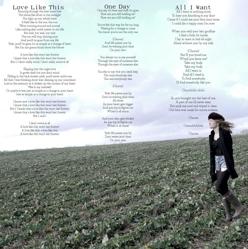
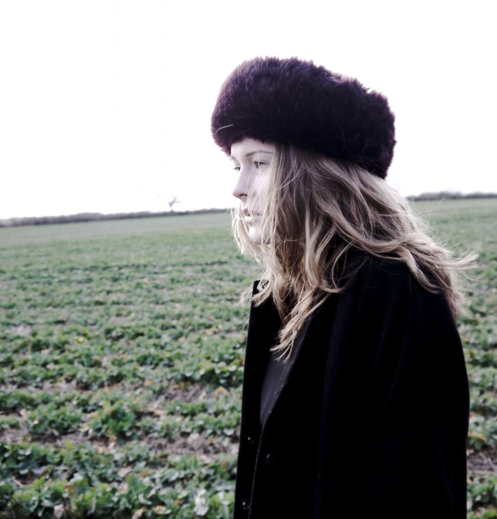
Image Insert:
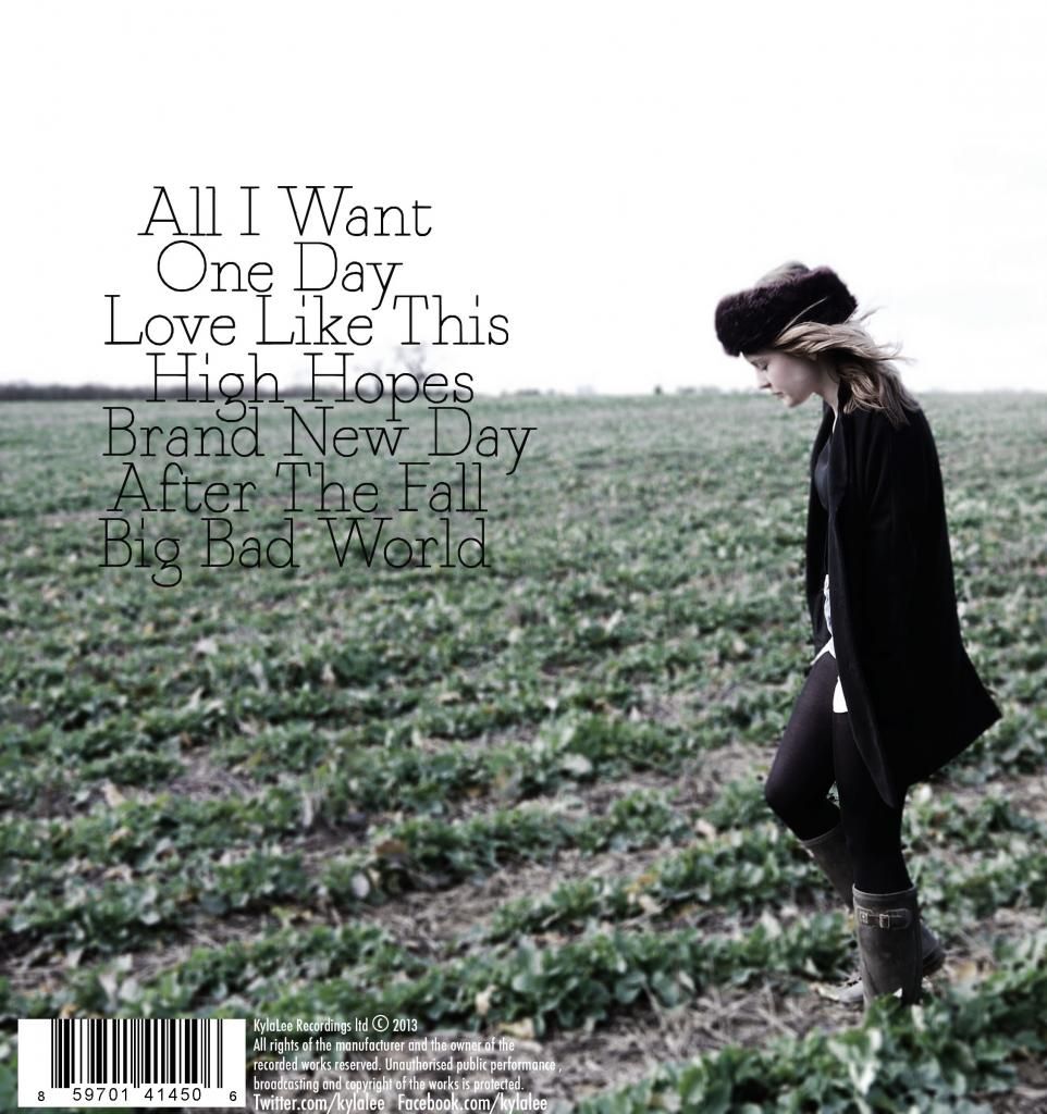
Back Cover:
Monday, 10 February 2014
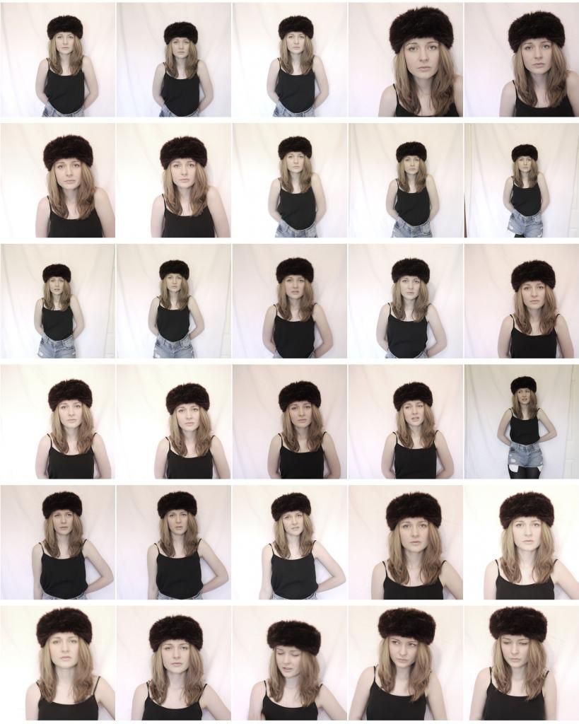
Ancillary Task Contact Sheets
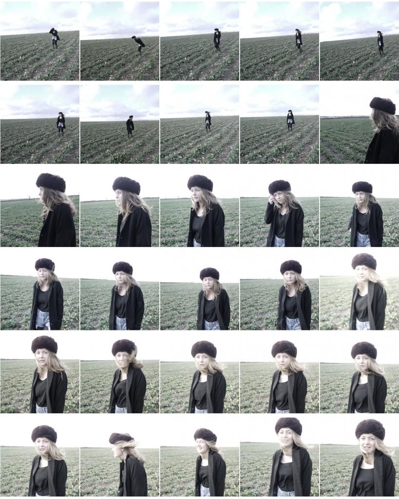

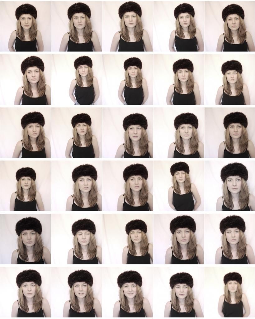
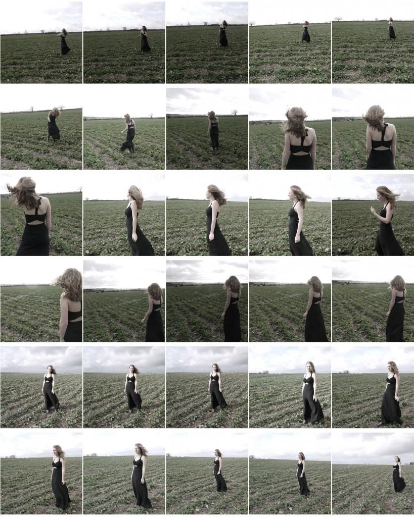
This a few contact sheets that summarise the photoshoot. I decided to take a huge variety of shots, including two out fit changes so that i could collect more material. In some shots the model is wearing a long black floaty dress, that represents the mourning and loss within the music video - almost representing a funeral dress. The second outfit involves the model wearing a big hat, in winter coat.
I also took a series of indoor and outdoor shots using the same outfits, i plan to experiment with both of these different shots which i plan to use for both the digipak and the poster.
Sunday, 9 February 2014
Friday, 7 February 2014
Thursday, 6 February 2014
Shot List
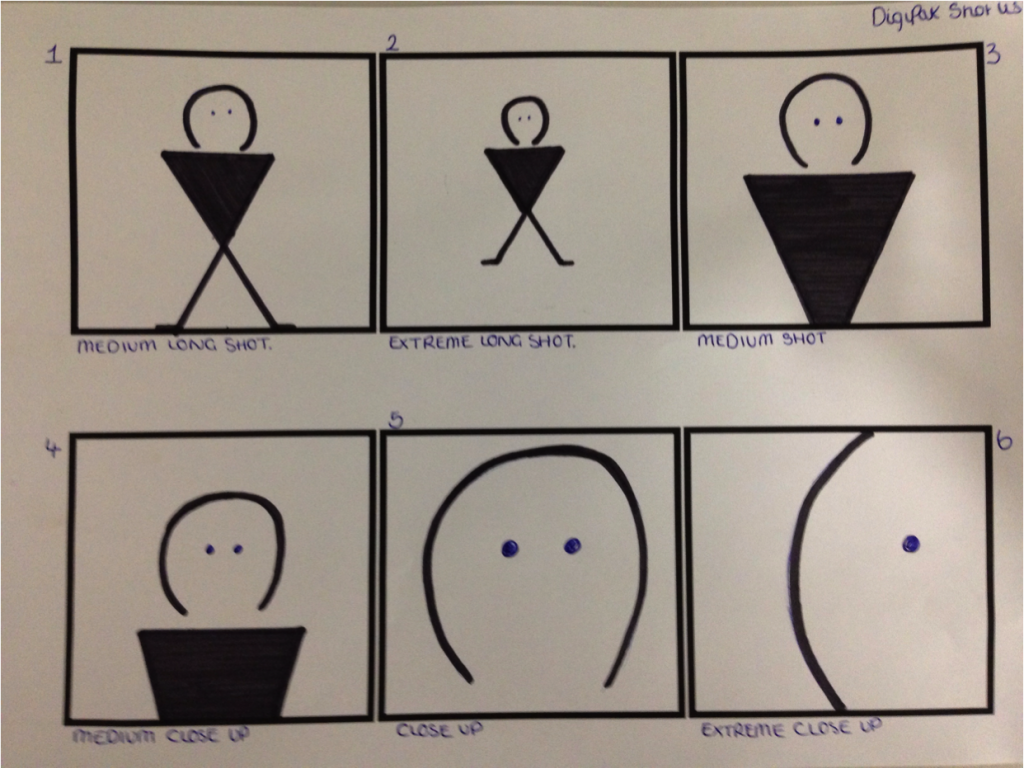
We plan to use a variety of shots in the production of the DigiPak so that we demonstrate our understanding and knowledge of a range of shot set ups. Shot 4 - a medium close up and shot 5 - a close up shot are the types of shots we plan to experiment with for our front cover of the DigiPak. This is because we feel these types of shots encourage rapport building with the audience and the model featured. These shots show very little background allowing the frame to concentrate on the focus of the models face and specific details. This increases the intimacy of the shot as the true emotions of the artist are represented, which means the audience in this case provide sympathy, and they are enabled to understand what the model is feeling, therefore enabling a sense of relationship building. This would ideally represent the genre of the music video and narrative as themes of sadness and loss would be portrayed. For the back cover of the DigiPak we continue to add to this genre connotations through the use of a medium long shot or an extreme long shot - as presented in frame 1 and 2. These shot types allow for a full length shot of the model with the emergence of background and a sense of place. Due to the realistic shot, the audience will be presented with not only focus on the model but also the surroundings in which she is in. We plan to use this type of shot, where the model is standing alone in a field/ country side setting, we aim to achieve this to attempt to portray the loneliness and isolation that the protagonist in the music video now feels, further indicating the theme of loss.
Mise - En - Scene:
We want to achieve the images on the front and back of the DigiPak with as much natural and natural looking light as possible Although we are aware that location and resources are difficult in the close up shots of the model, we would like to use natural lighting so that the shadows upon the artists face are soft. The image on the back of the DigiPak will also include natural lighting and we plan to experiment with sunlight and white light of a cloudy day.

For the inside of the DigiPak we then plan to experiment with candle light and fire. We have decided to use candle light rather than the use of model face shots, so that we still attempt to keep shot variety different. The flame of a candle can be interpreted to suggest the fragile state of the relationship of the two protagonists.
Monday, 3 February 2014
Action Plan For Ancillary Photoshoot
03/02/14: I plan to shoot a second photo shoot working from plans and feedback of the pilot attempt. I plan to create a contact sheet of images so that i have lots of variety of shot types, from extreme close ups, to medium long shots, so that i can chose the best type of shot for our production. The shots will include the model standing in front of a white screen so that upon editing, the background is easier to manipulate. The model will be wearing a pastel pink or white coloured top with a similar coloured flowers in her hair. Her makeup will also be natural and subtle so that we continue to create a look of vulnerability and loss, so that any harsh eye makeup will not withdraw from this. I then will take shots of the model looking directly into the camera but also shots that appear more natural, such as the model looking else where and positioned to the side so that the face is side on. I will also consider, after feedback in the pilot shoot, space for text within the frame. As we intend to employ the rule of thirds concept, we need to leave room above the head and to the side so that we are allowed to proportionally fit the artists name and song title in the frame, without cutting anything off.
However, unfortunately the protagonist used in the final draft of the music video is no longer available for our media use due to unforeseeable circumstances, which means we cannot use her in the anillary tasks. Although this is a huge disadvantage we intend to take the exact same shots, and use the same plan for the model previously used in planning. Therefore, despite the model being different the shots would have had the same outcome.
However, unfortunately the protagonist used in the final draft of the music video is no longer available for our media use due to unforeseeable circumstances, which means we cannot use her in the anillary tasks. Although this is a huge disadvantage we intend to take the exact same shots, and use the same plan for the model previously used in planning. Therefore, despite the model being different the shots would have had the same outcome.
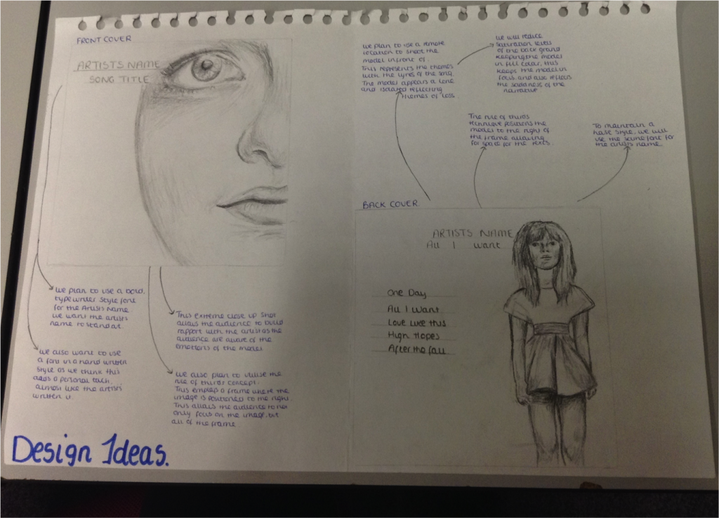
Front Cover Proposal
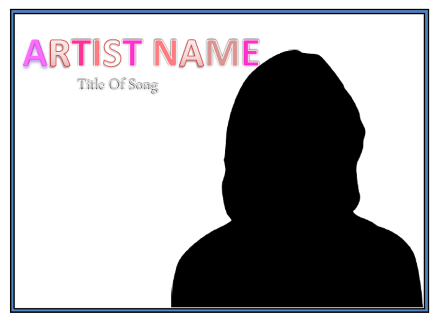
This is our first design idea for the album cover.
It adopts the rule of thirds concept, which arguably emphasises the power and meaning behind image framing, by following an invisible 3x9 grid behind the art. By having the model pushed to the right hand side of the frame it not only enables the audience to become observational of the entirety - rather than being focused on a set feature - but it also represents the lyrics and narrative of the music video. Due to there now being space to the left of the model in the frame, it suggests that there is something missing that used to be there before, this relates to the narrative as the protagonist has lost her loved one. This is also further suggested in the way that the title of the song 'all i want' is further away from the model, this also may indicate that all the protagonist wants has been taken away from her, her loved one is no longer here and so 'all that i [she] wants' is not hers anymore. However, due to criteria purposes, we are aware that we are assessed on editing skills. This means that by leaving space of whiteness in the frame we could potentially lose credit as we are not taking full advantage of the whole frame. To overcome this we have decided to either use Photoshop to manipulate and edit a back ground into the shot, this may include brush effects - such as smoke or blur, so that we demonstrate and portray editing knowledge. Or alternatively, we could potentially 'zoom in' or take an image that is more closer, intimate and bigger so that more of the frame is filled.
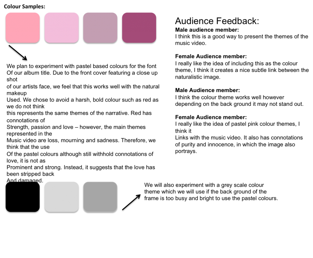
We also plan to use a colour theme of pastel pink pinks, which will be presented in the Artists name and also in the models clothing and makeup. We have chosen this as despite red being represented as the theme of love, passion and romance all of which are found in our music video, we feel that because the couple aren't featured on the front cover, we needed to represent other themes also significant such as loss and innocence. Therefore, the pastel pinks represent a love story stripped back of all happiness, and therefore the colour red with connotations of passion, has faded.
Subscribe to:
Posts (Atom)